UX/UI Design
Mobile App
Hotel Booking
Project
UI Design
Timeline
2 weeks | 2023
Role
UX/UI Designer
Team
Individual
About the Project
Background
Agoda is one of the world's fastest-growing online travel booking platforms, headquartered in Asia. It provides travellers with easy access to a wide variety of luxury and budget hotels, apartments, homes, and villas to suit all budgets and travel needs.
For this project, my objective was to understand the users and their existing pain points when using the Agoda app.
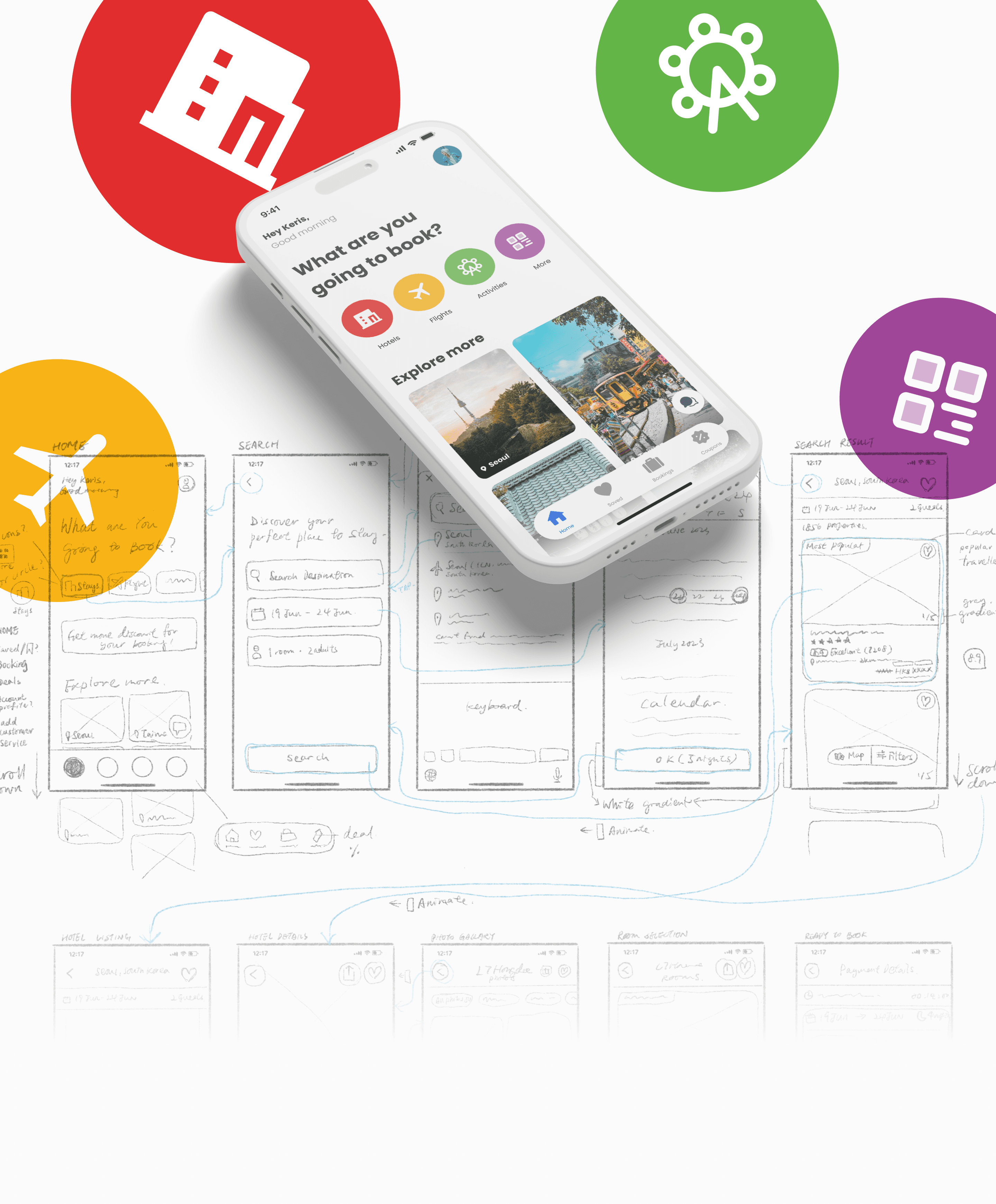
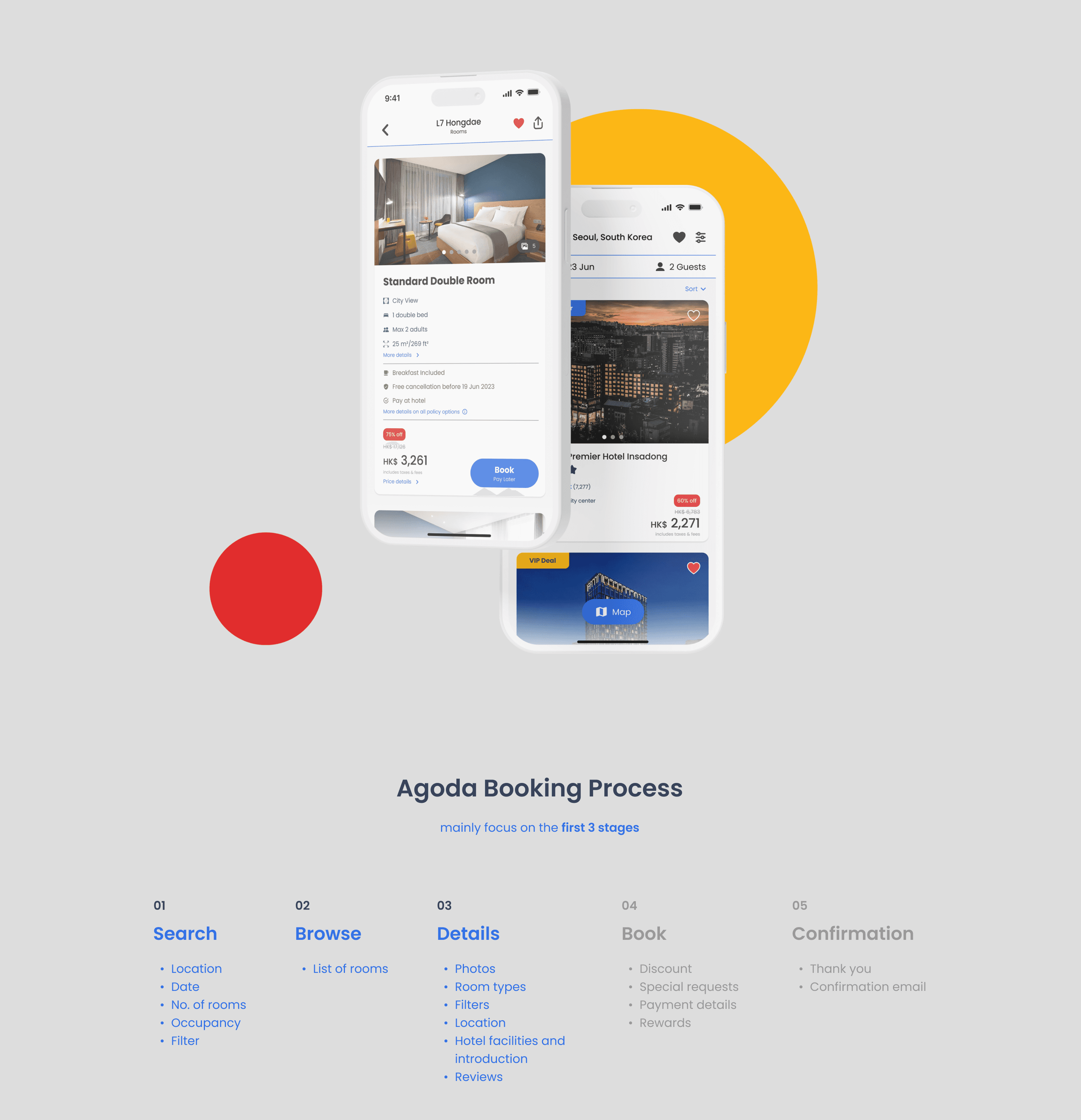
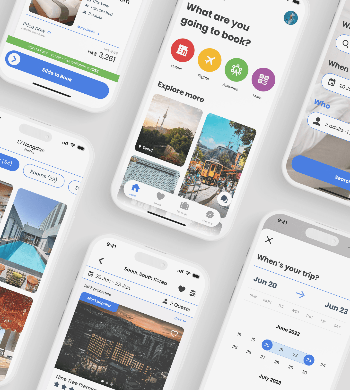
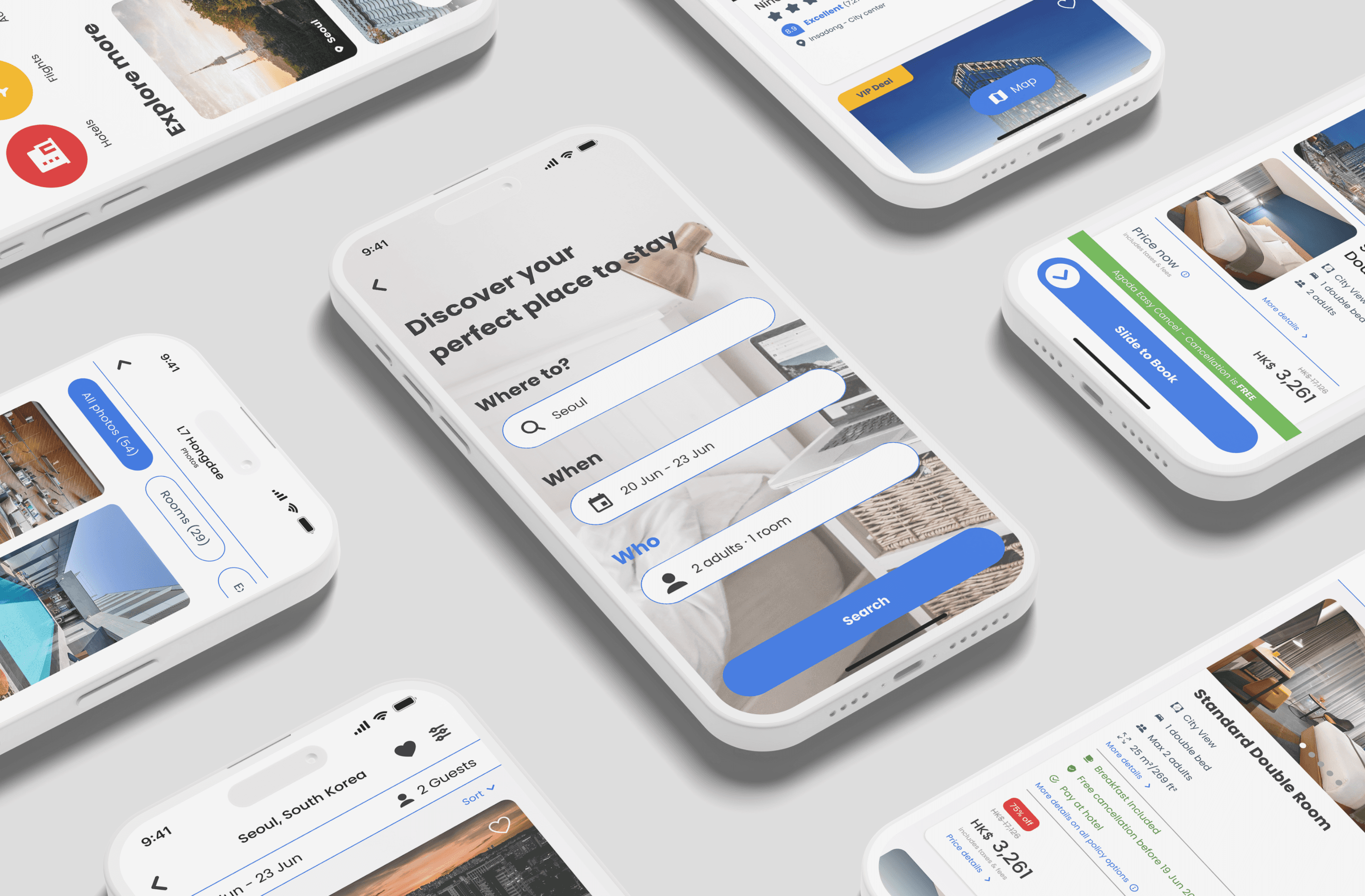
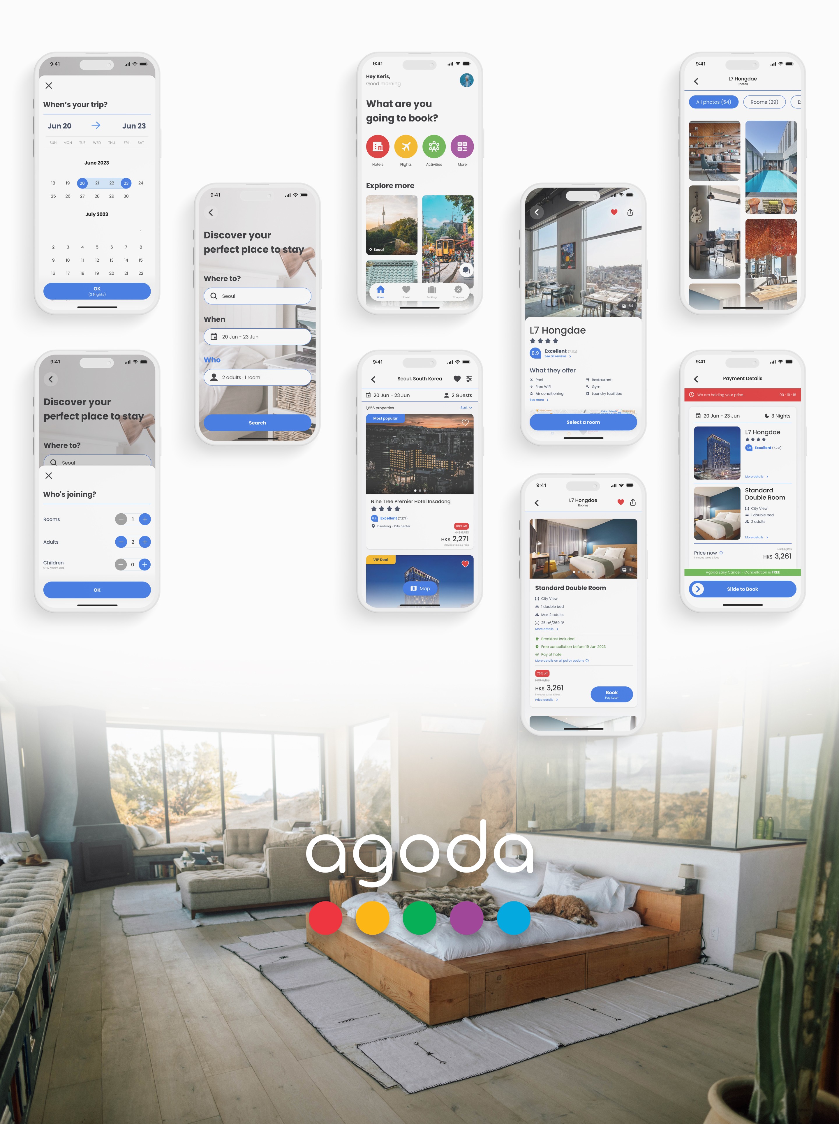
My focus was on improving the user interface (UI) and visual design of the hotel booking process.
Problem Statement
Users frequently use the app to book hotels for vacations and compare prices with other online travel agencies (OTAs).
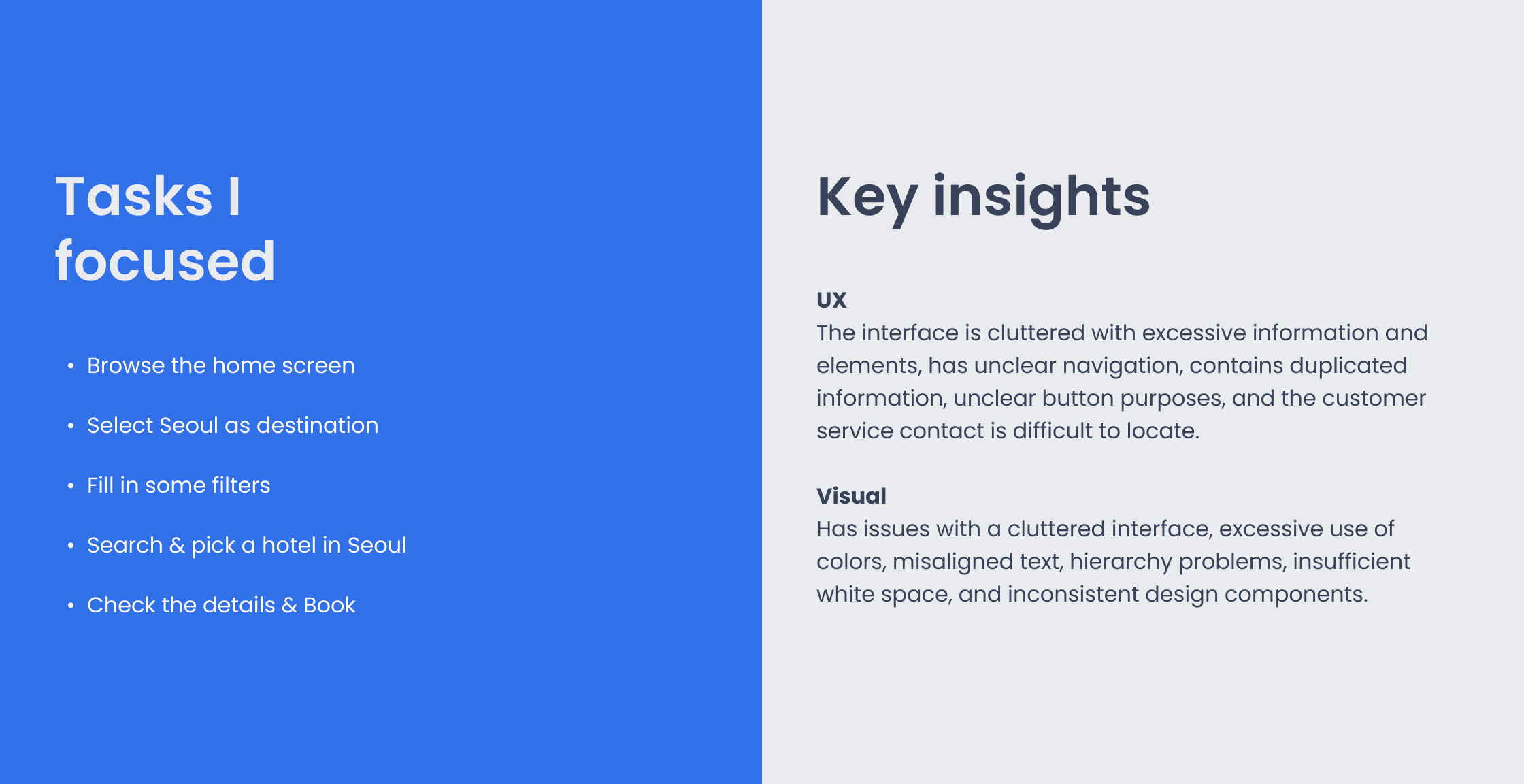
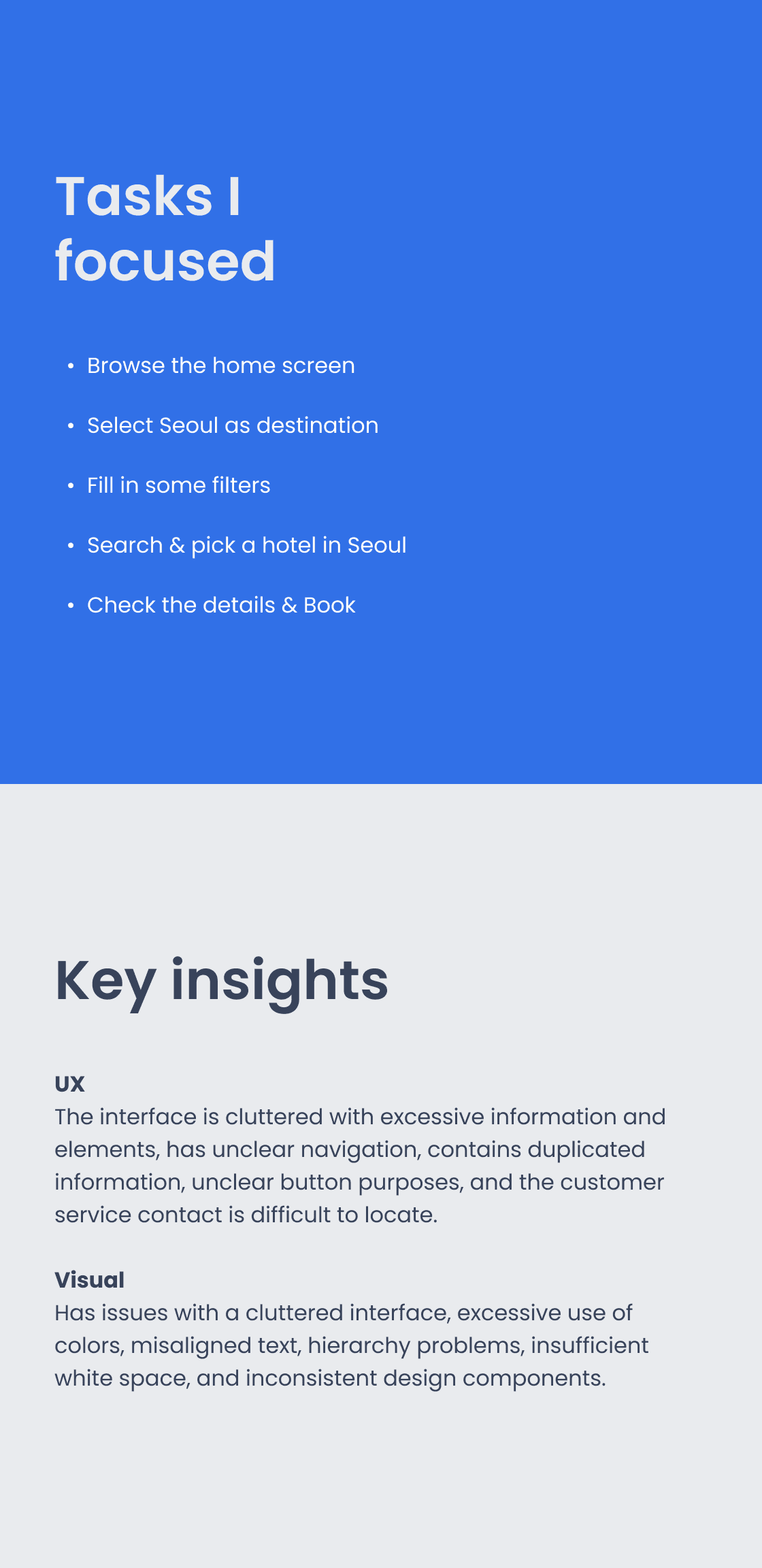
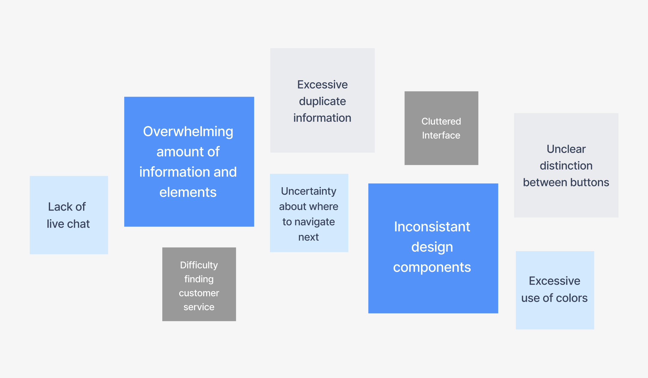
However, they face several issues such as unclear navigation, challenging access to customer service, information overload, a cluttered interface, excessive color usage, lack of information hierarchy, and inconsistent design components.
Solution
Improving the navigation
Simplifying the UI, clean up the unnecessary elements, categorise informations
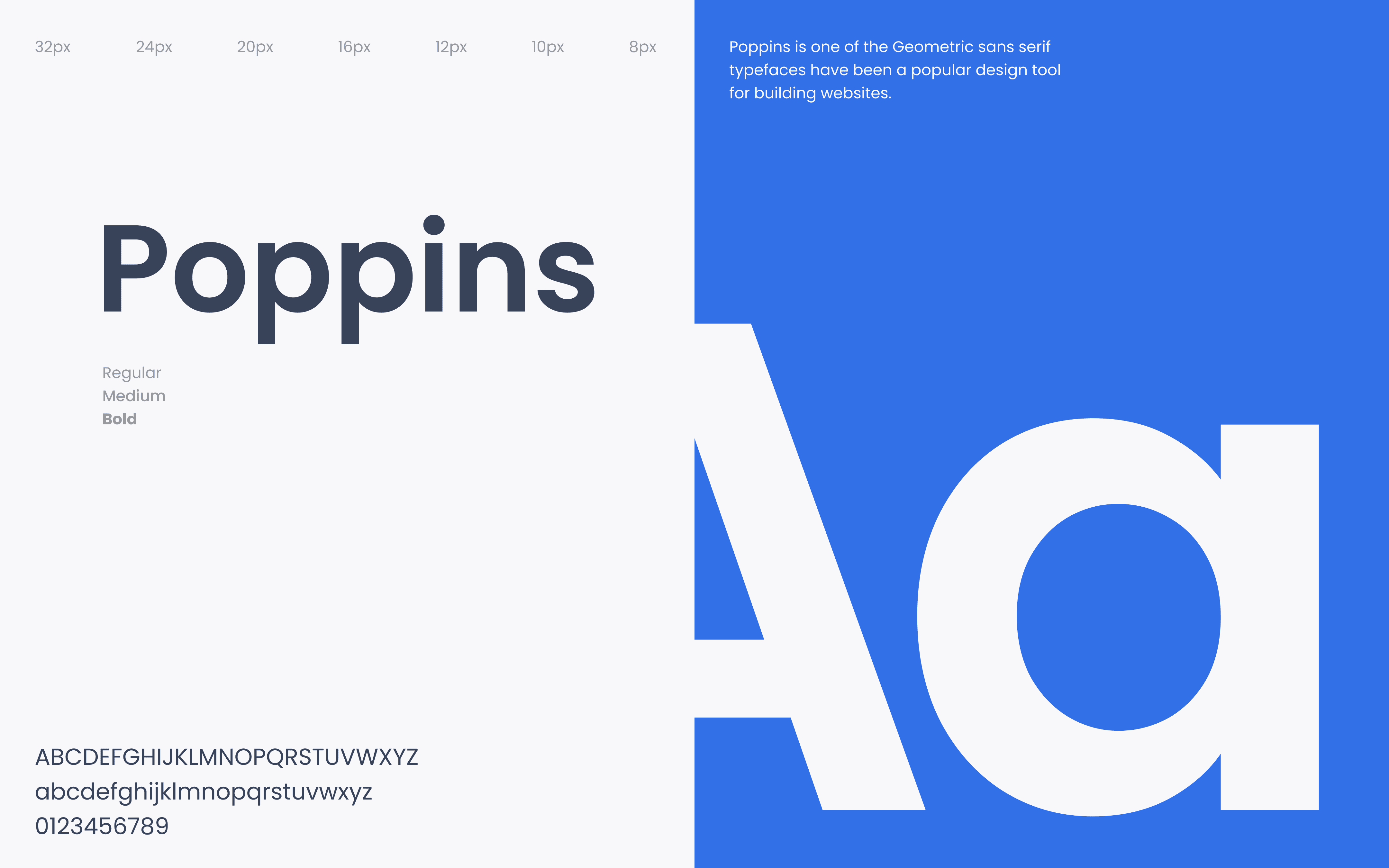
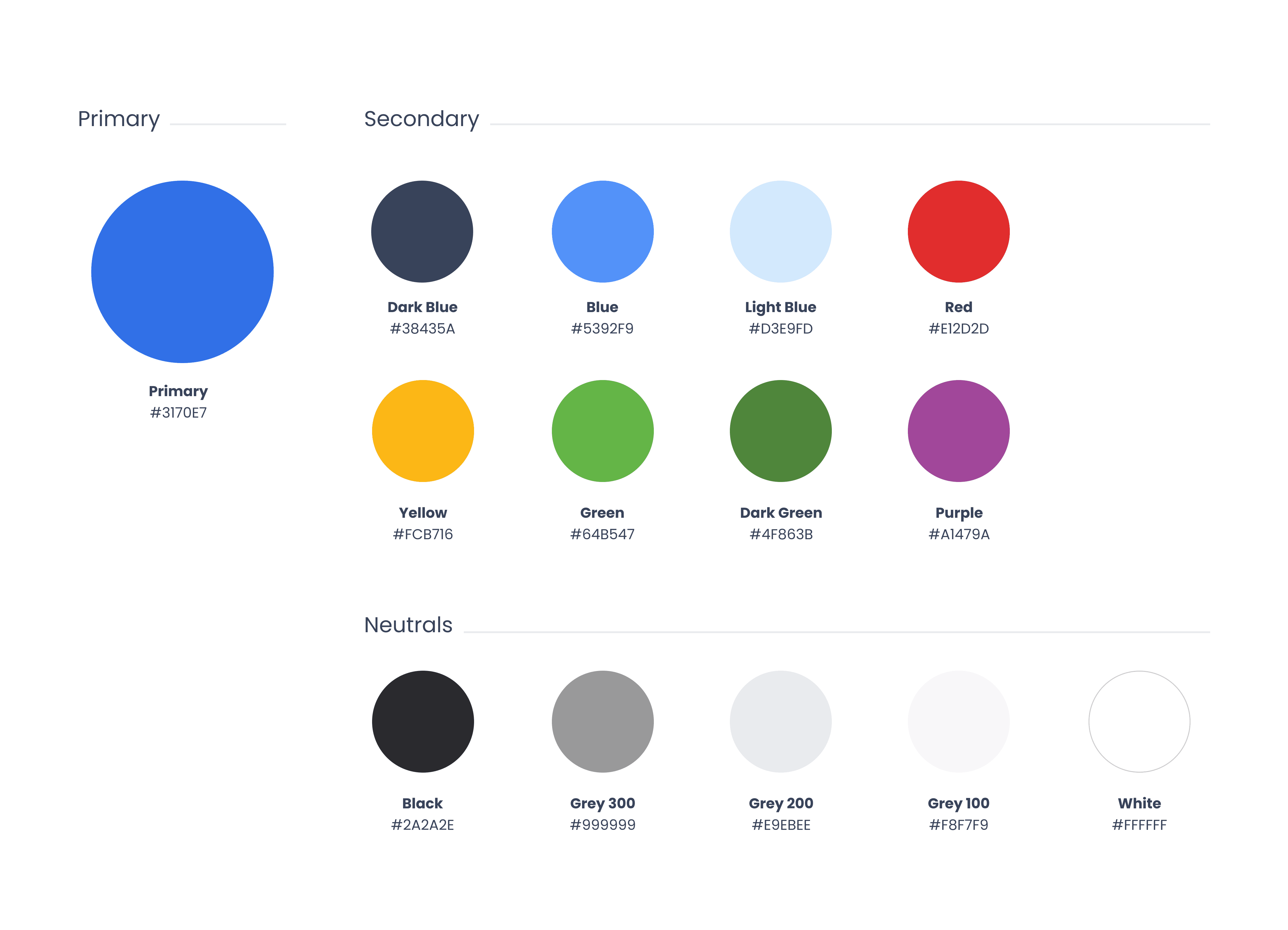
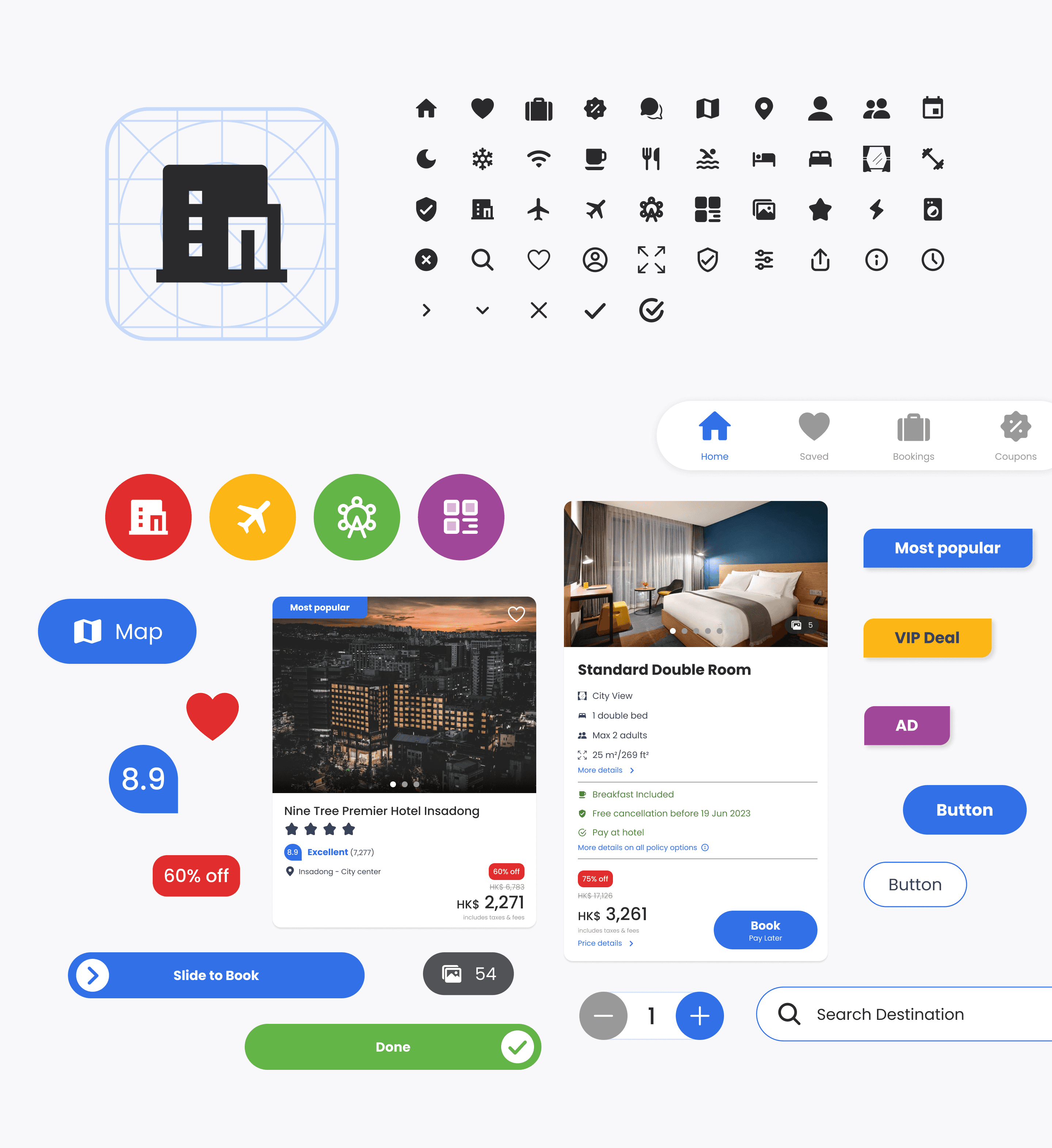
Make the UI minimal and friendly by changing the colors, shapes and typography
Ensuring that content is easy to understand and consume
Research
The research methods are to gain an in-depth understanding of user experiences and identify existing challenges they encounter while using the app. These involved conducting a usability test and making detailed observations.
WHAT I DID
Identifying Existing App Pain Points
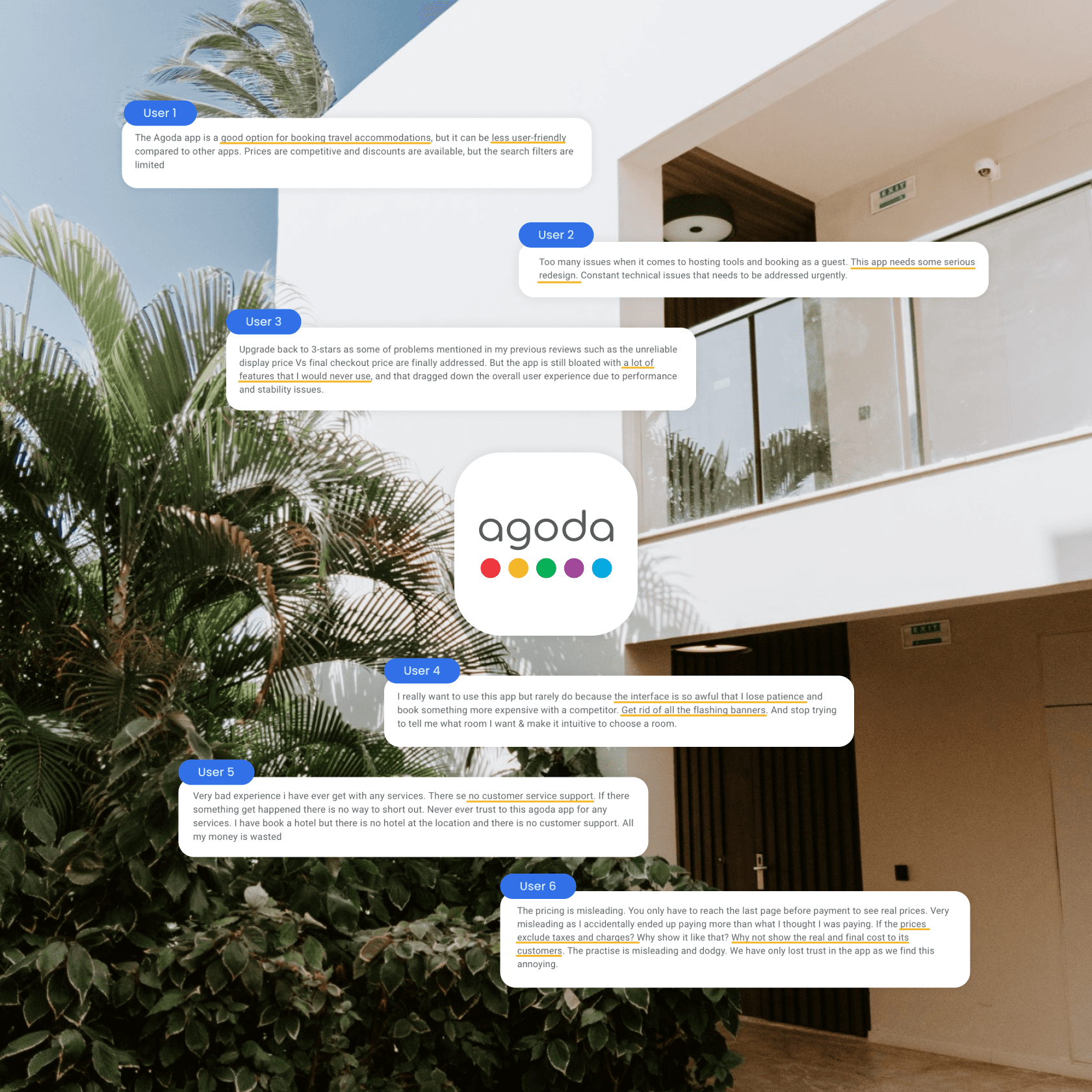
User Feedback
User Observation
UI References
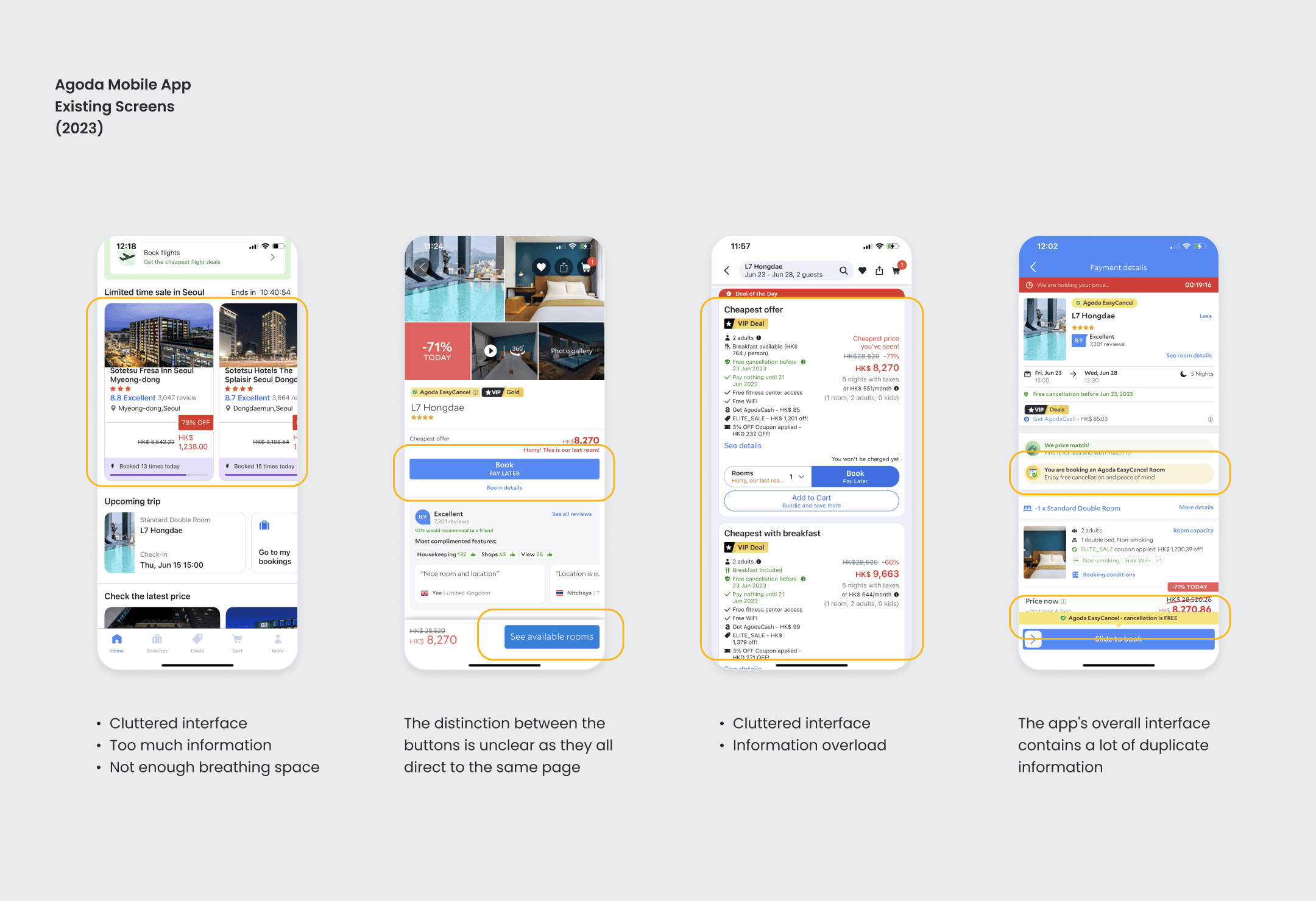
Existing App
During the research phase of my process, I primarily aim to identify the existing pain points within the application. This involves a thorough analysis of its current state, focusing on areas where users may be facing difficulties or inconveniences. By identifying these issues, I gain a clear understanding of where improvements are needed to enhance the overall user experience.
User Feedback
I analyzed user comments and feedback to gain insights into the challenges, pain points, and overall user satisfaction levels of the Agoda app.
User Observation
Through user observations, I can identify potential pain points or frustrations that users may experience. After identifying these issues, I can begin to find innovative and effective solutions to enhance the user experience.
To ensure easy navigation and quick information retrieval, it is recommended to keep the home page and hotel search page simple and minimalist.
This will help users locate the information they need with ease.
The amount of information presented on the hotels list and hotel details pages can sometimes feel overwhelming.
To address this issue, I have streamlined the user interface (UI) to only display the essential information that users need.
The current app design includes unnecessary duplicate information and lacks clarity in distinguishing between buttons.
To resolve these issues, my proposal is to simplify the interface by having a single call-to-action (CTA) button for each booking option. Additionally, I suggest displaying only the final price to avoid confusion for the user.
Final Thought
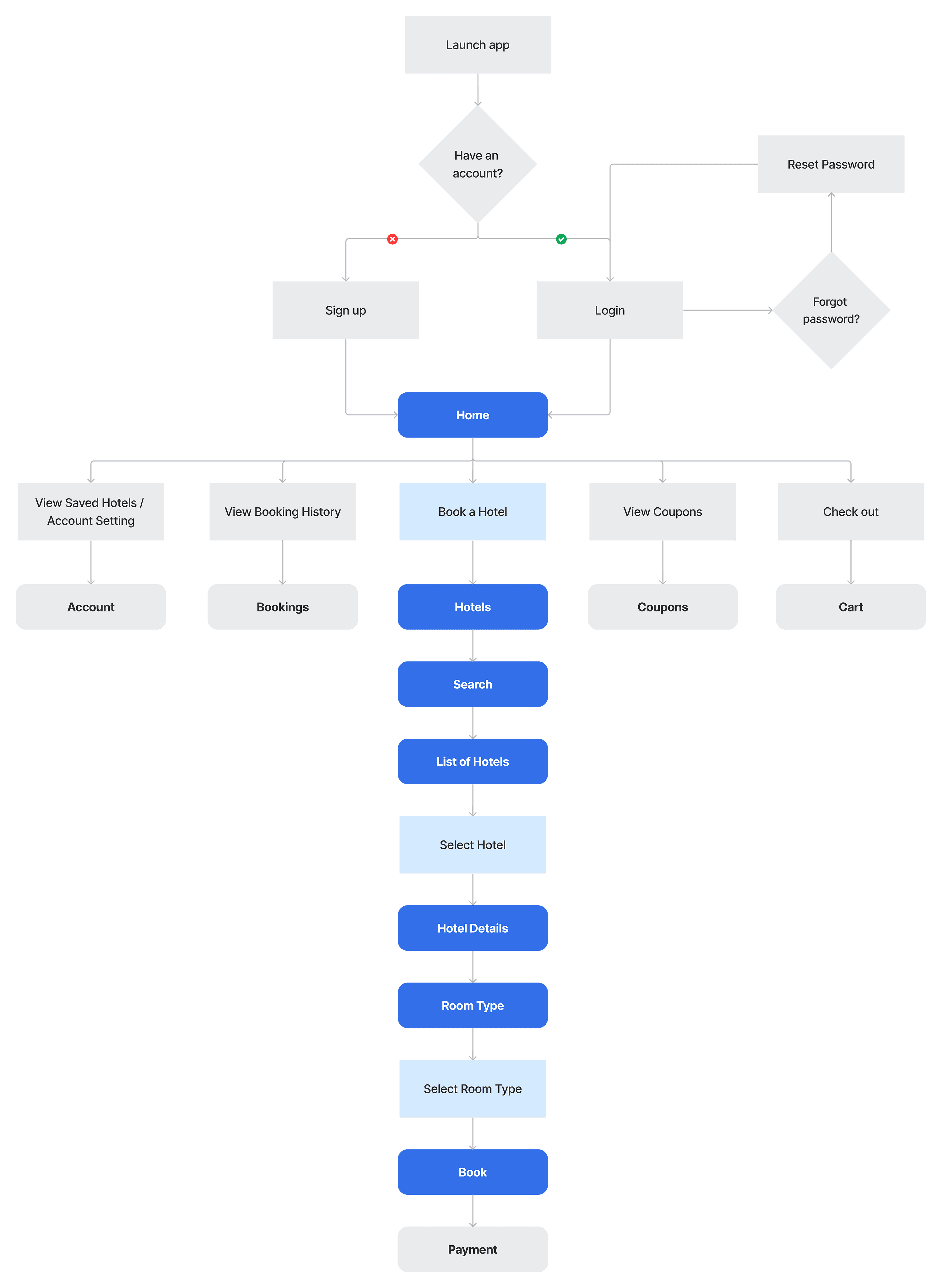
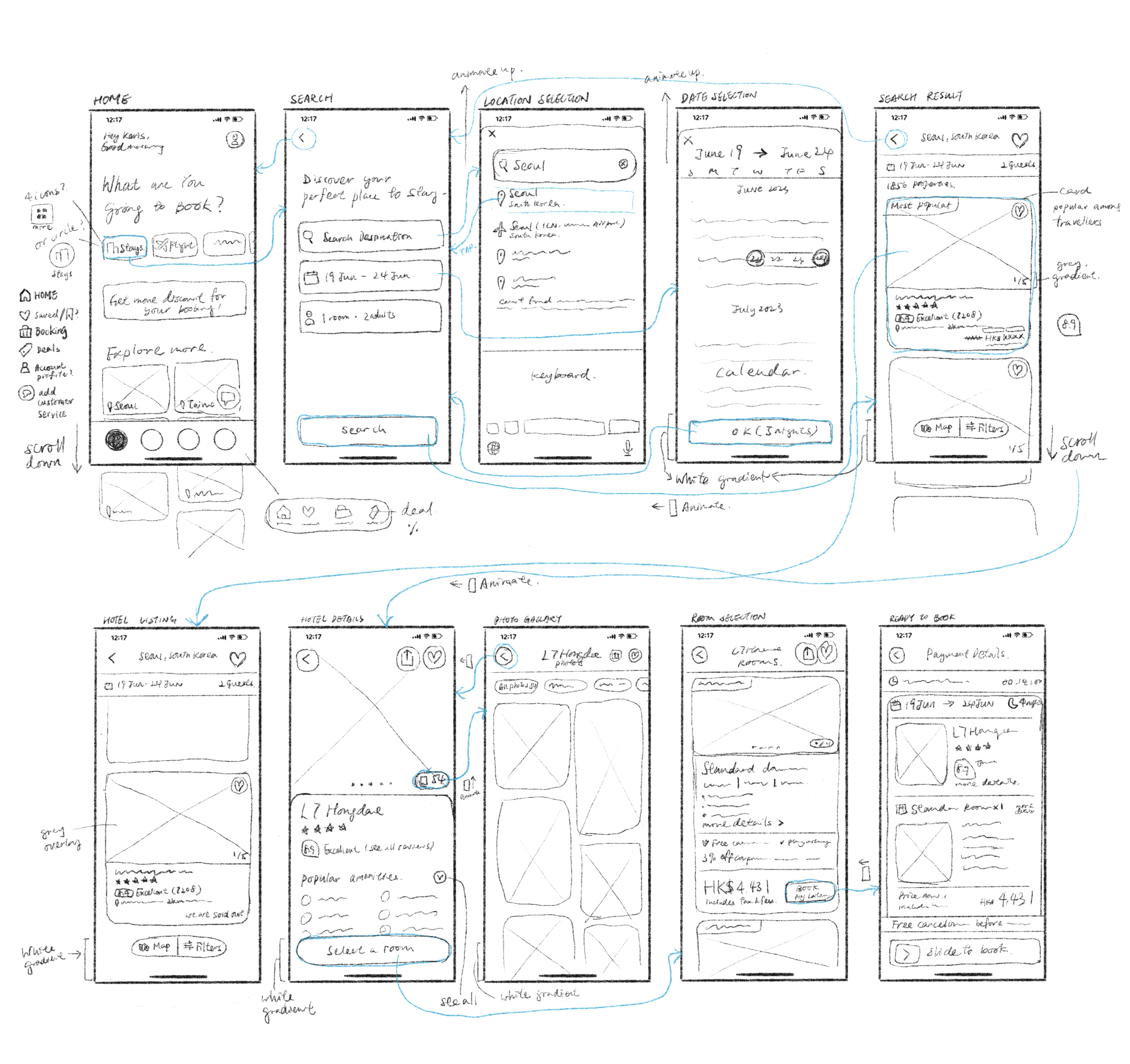
This is my first User Interface (UI) Project. One of the challenges I encountered during this project was maintaining focus and clarity when creating the wireframe to determine the subsequent steps. It required me to carefully analyse and consider various aspects before making decisions.
However, through this experience, I have gained valuable knowledge and skills that will benefit me in future projects.
