UX/UI Design
Wayfinding System
Client
MTR Corporation Limited
Timeline
4 weeks | 2023
Role
UX/UI Designer
Team
4 UX/UI Designers
2 Engineers
1 Product Owner
About the Project
Background
MTR is a leading provider of rail transport services, with a focus on safety, reliability, customer service, and efficiency. Their objective is to connect and enhance communities through innovative and sustainable services.
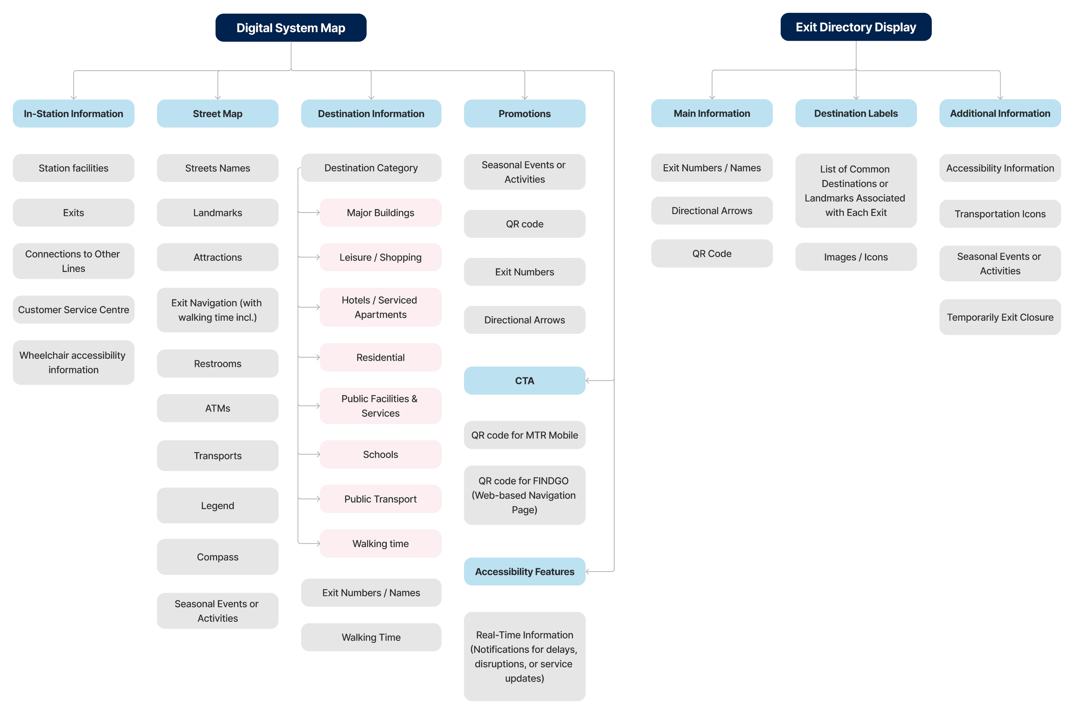
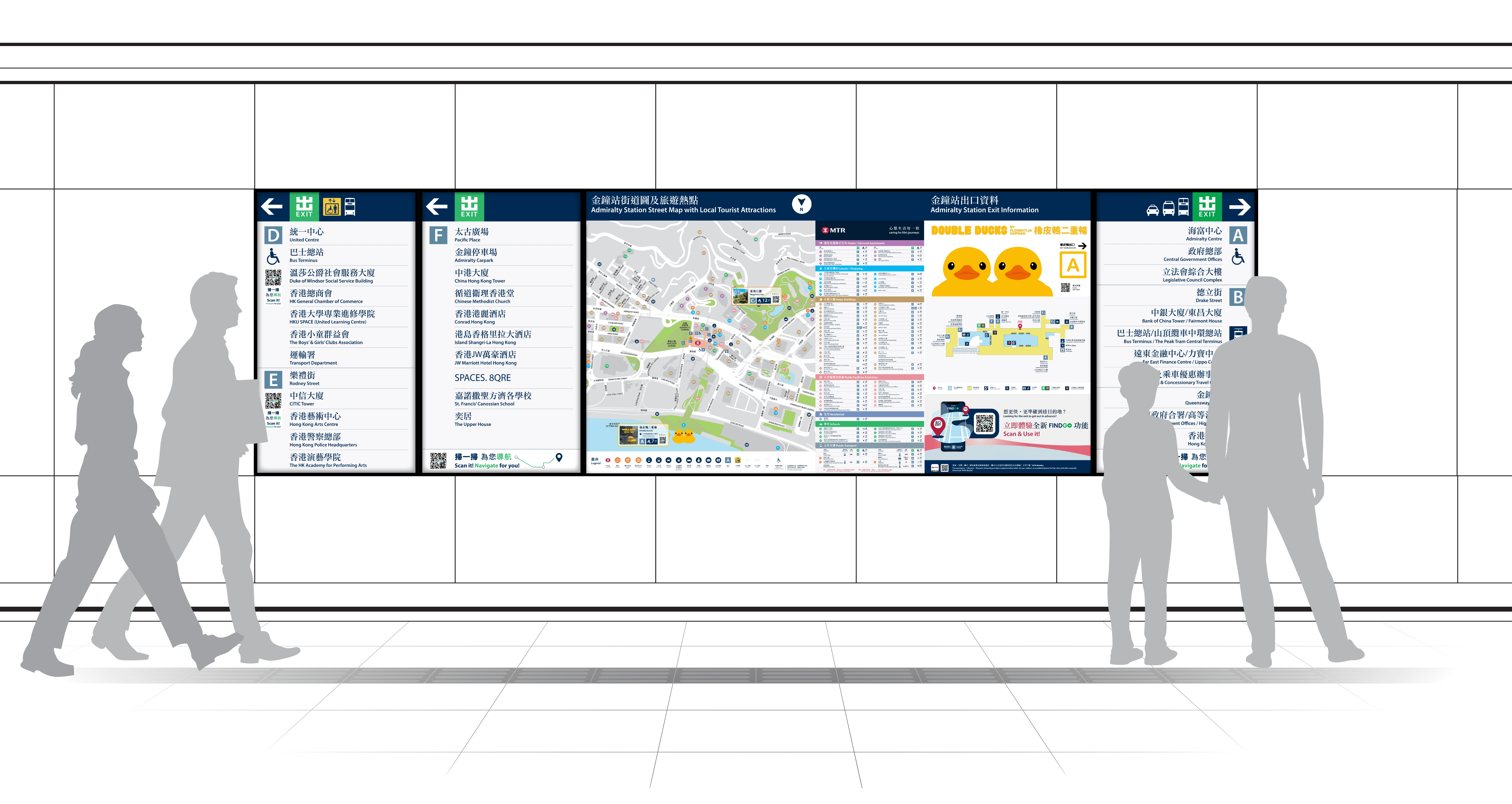
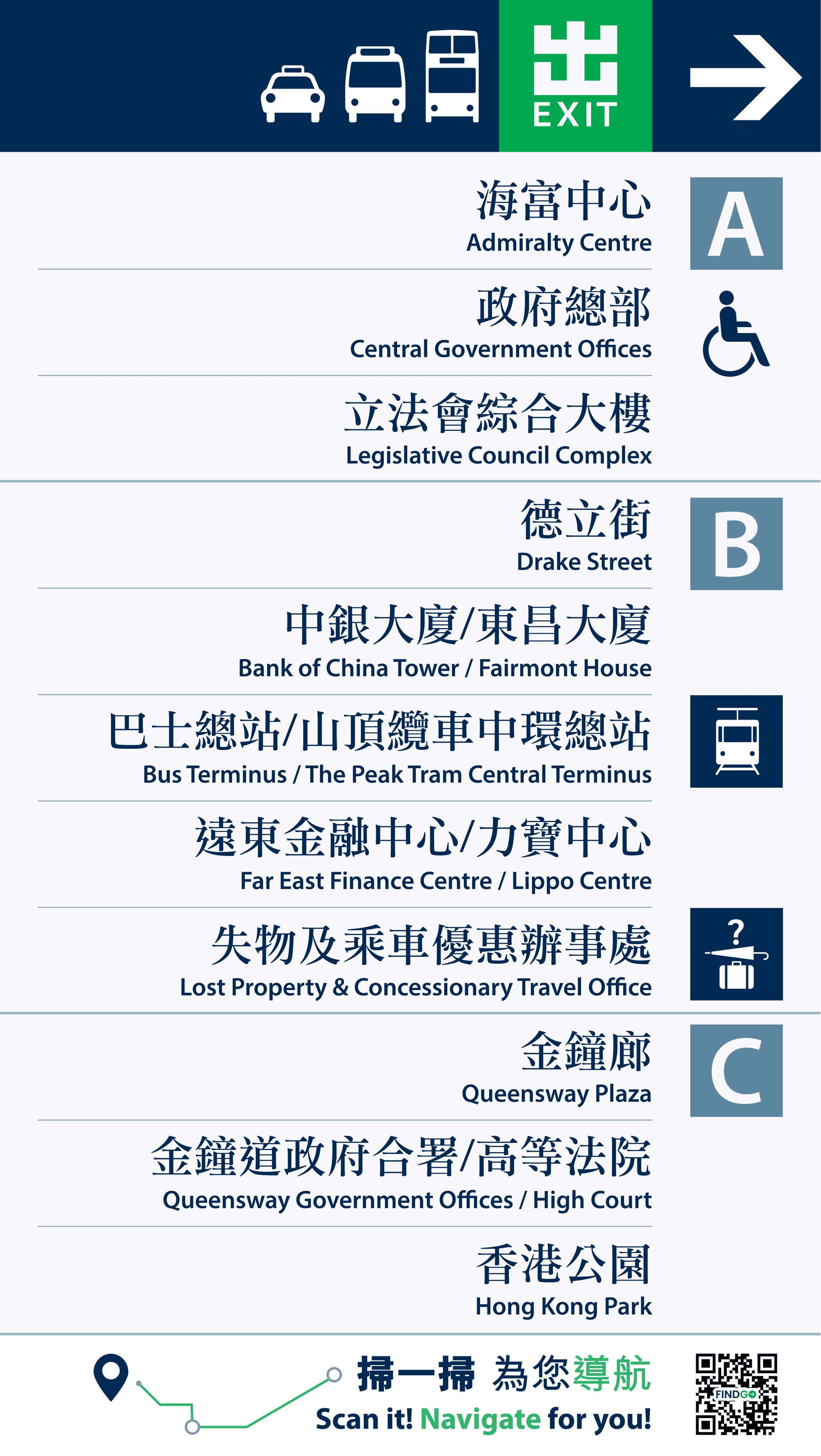
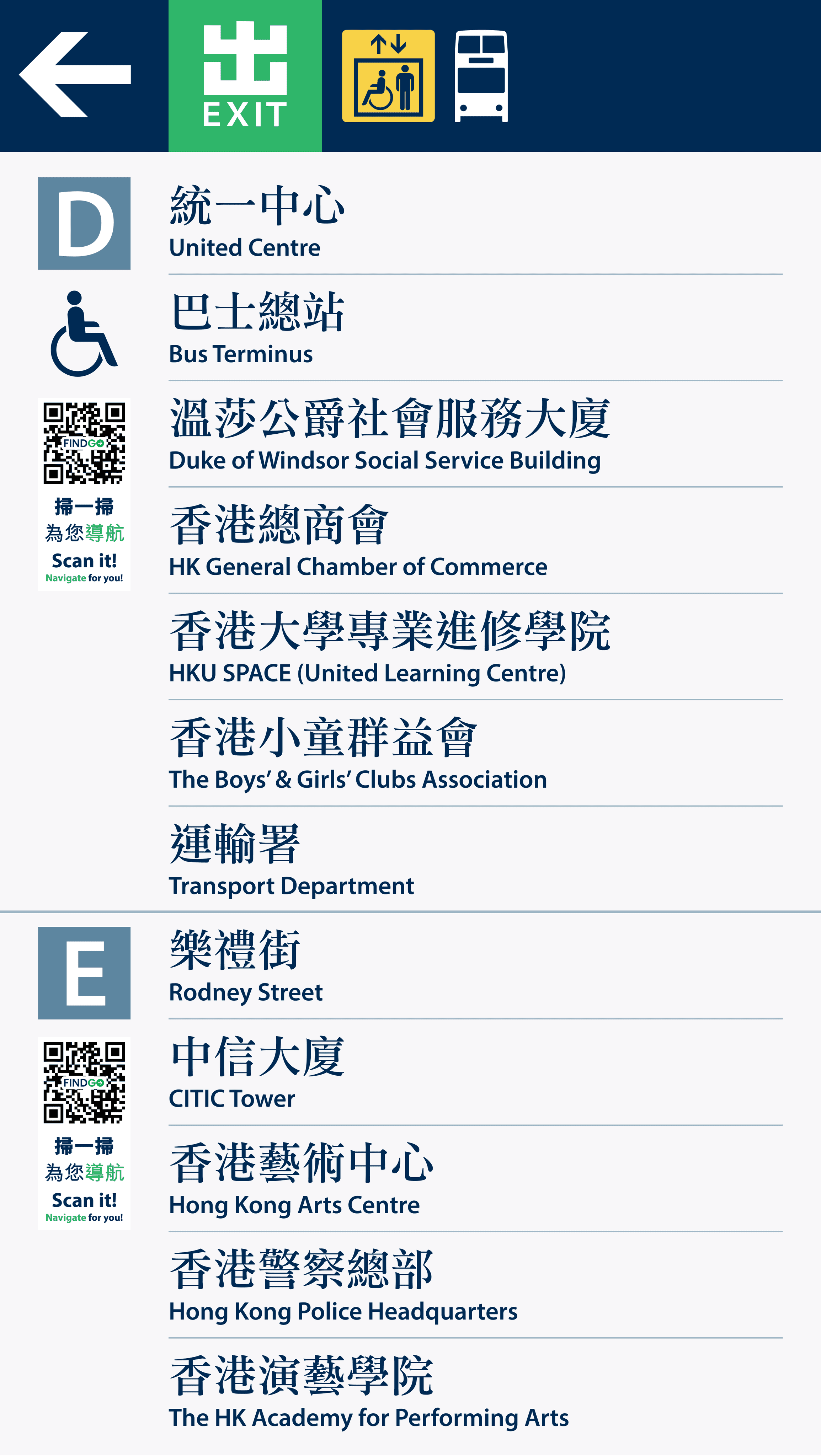
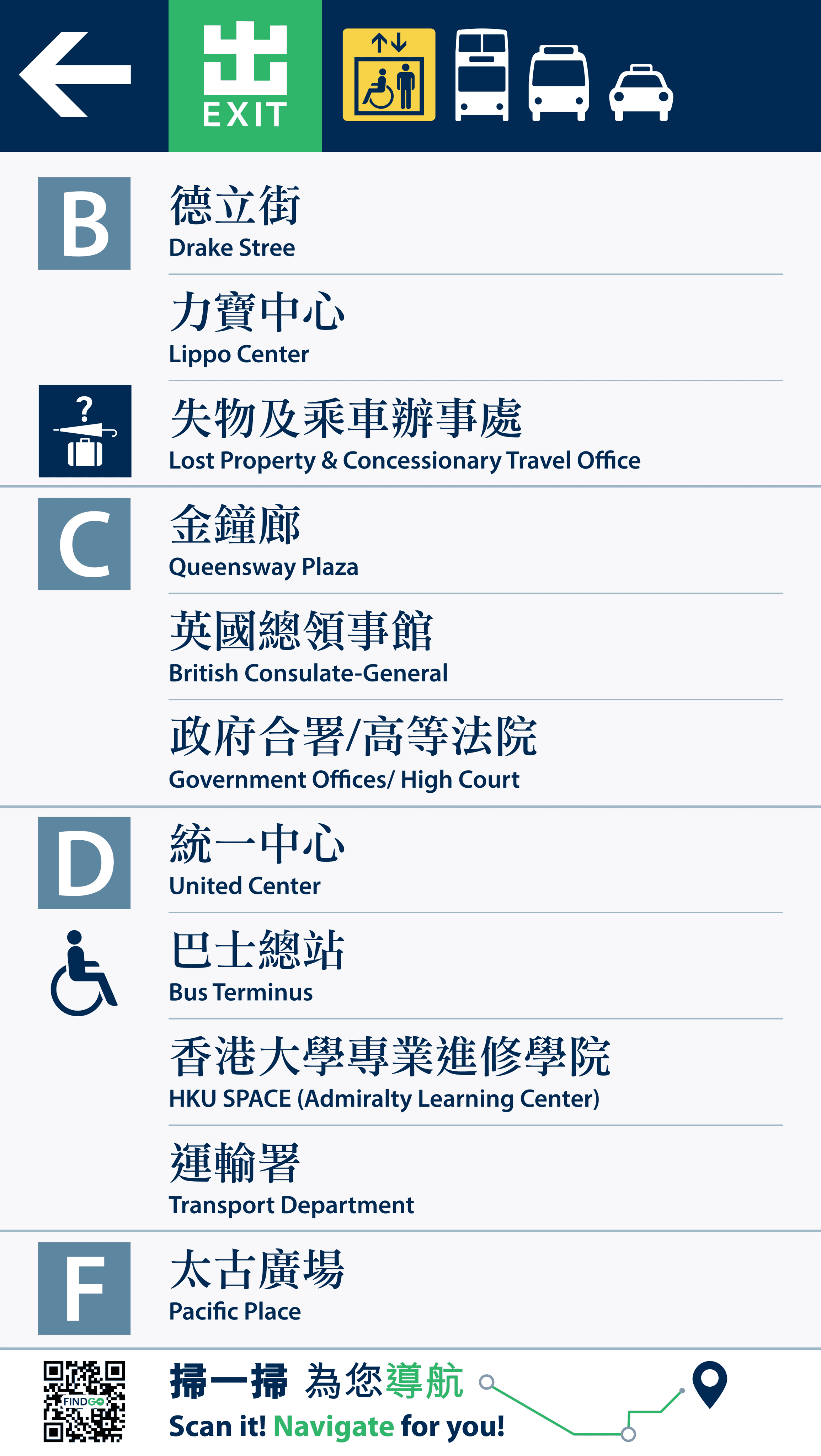
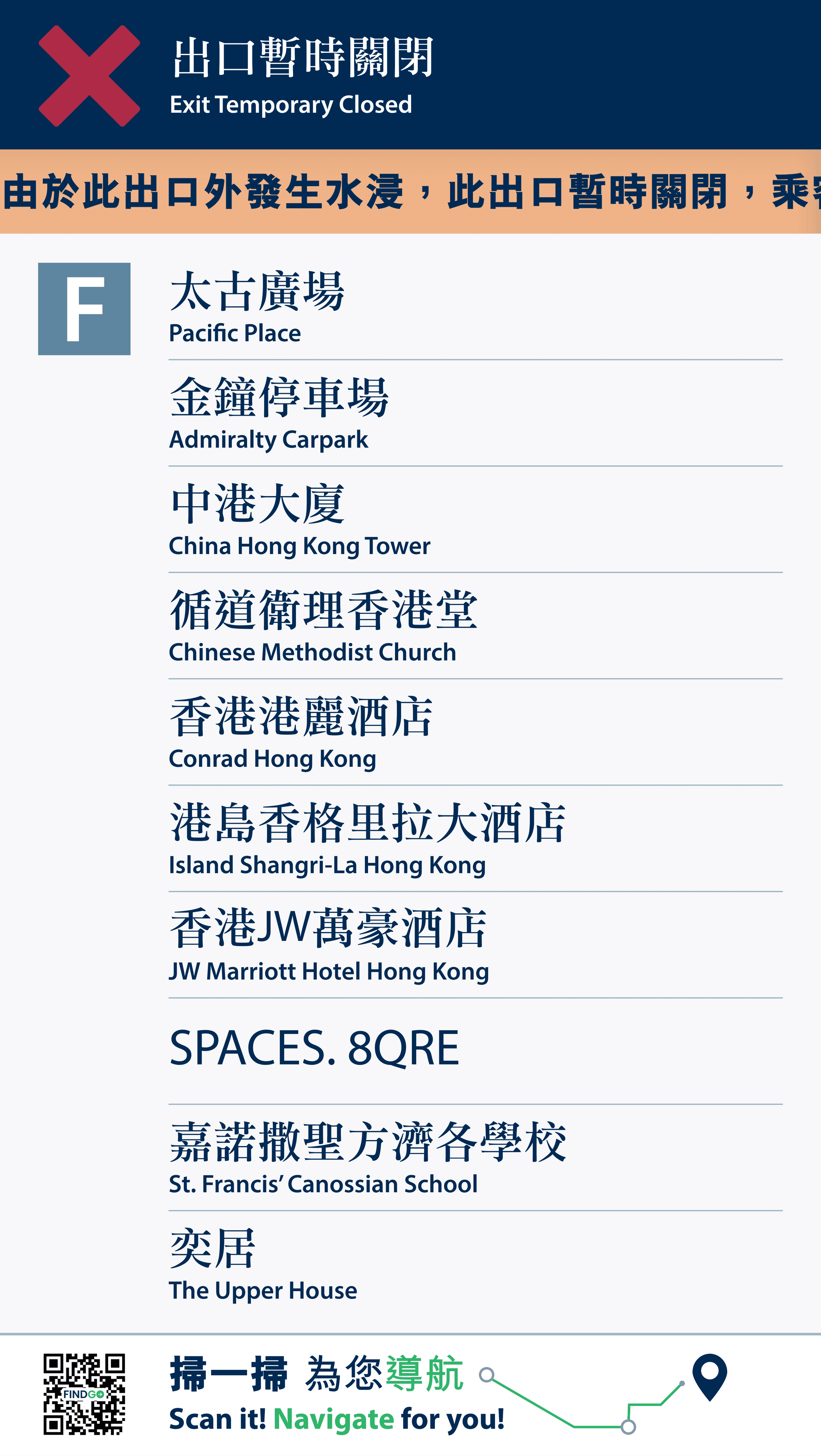
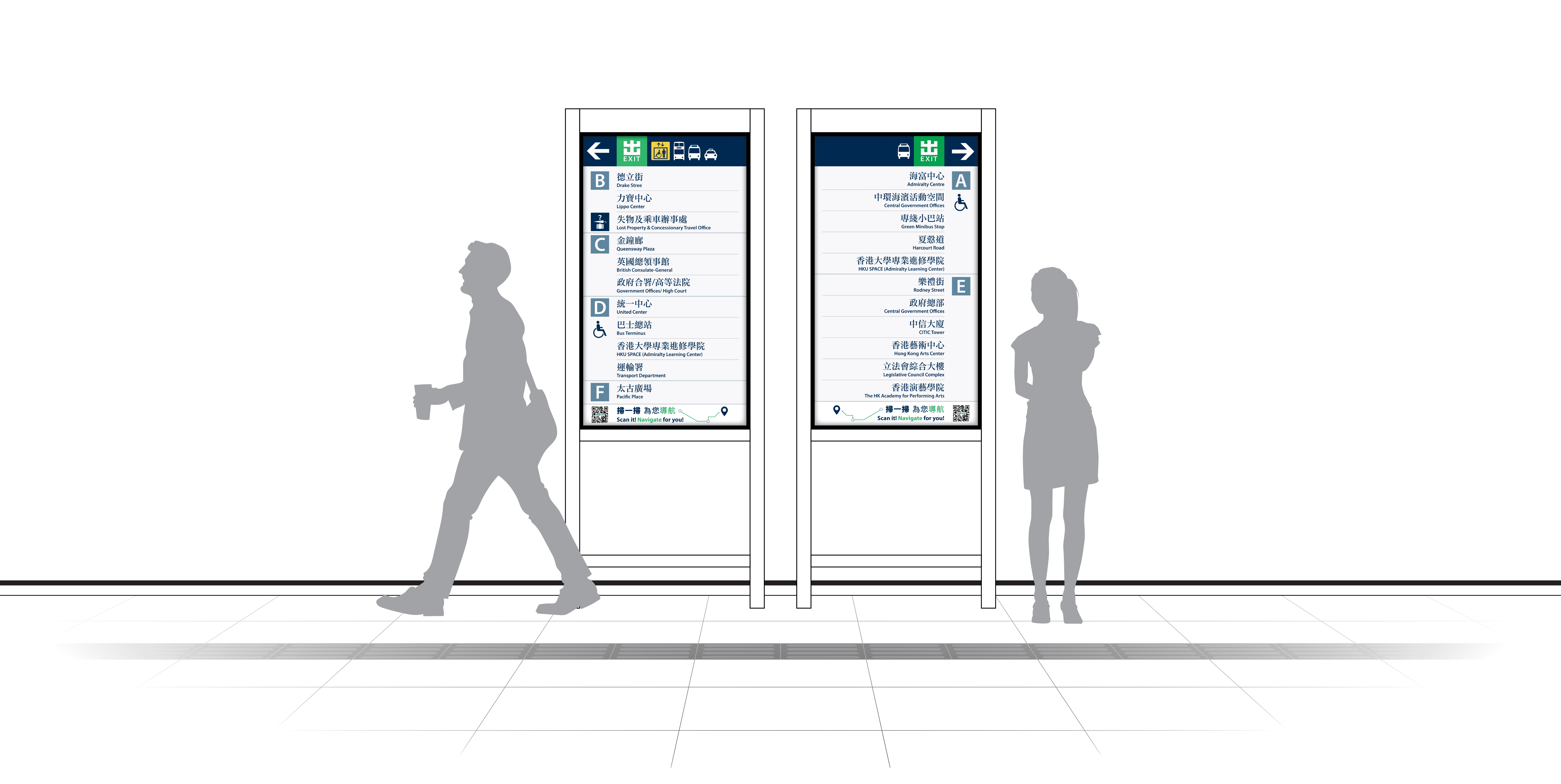
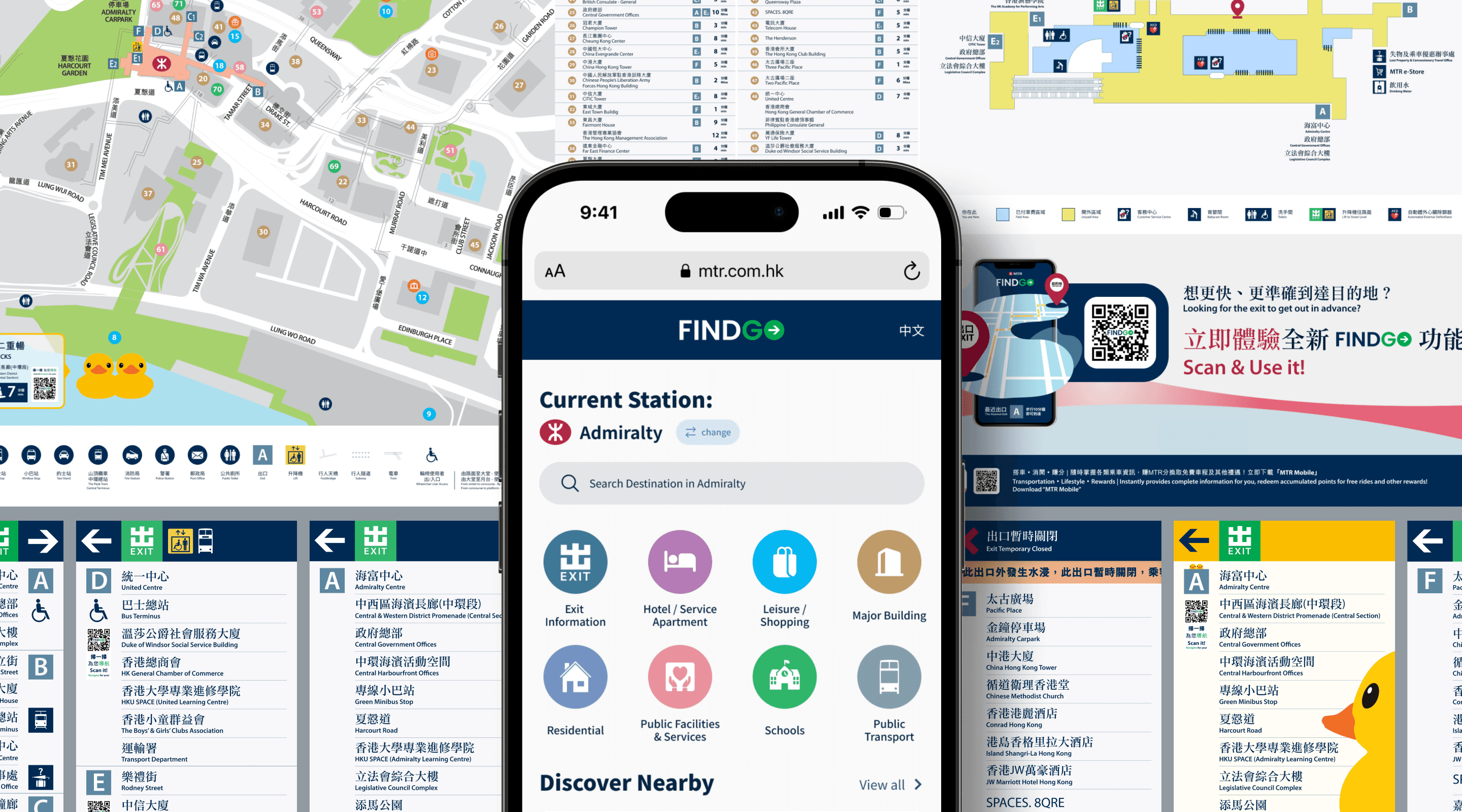
Our current challenge is to develop a next-generation station wayfinding system: a digital system map and exit directory display system at Admiralty station.
Problem Statement
Goals
Identify user pain points
Find out the pain points of MTR users when finding the exits and navigating to their destination.
Enhance user experience
Come up with solutions to solve these pain points and enhance user experience related to exit-finding and wayfinding.
Monetised opportunities
Explore on additional monetised opportunities which are beneficial and value-adding for both the MTR company and its users.
Solution
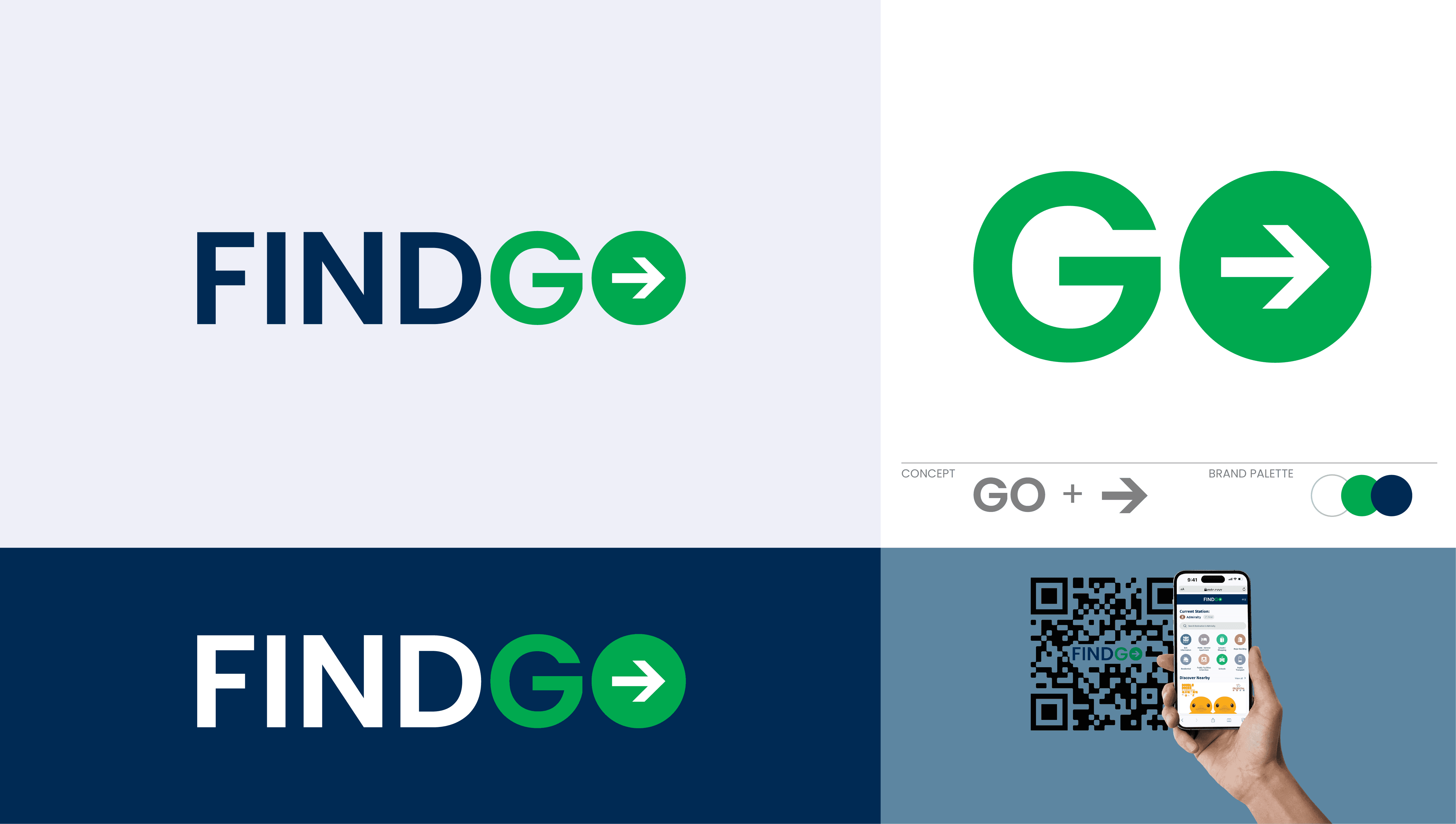
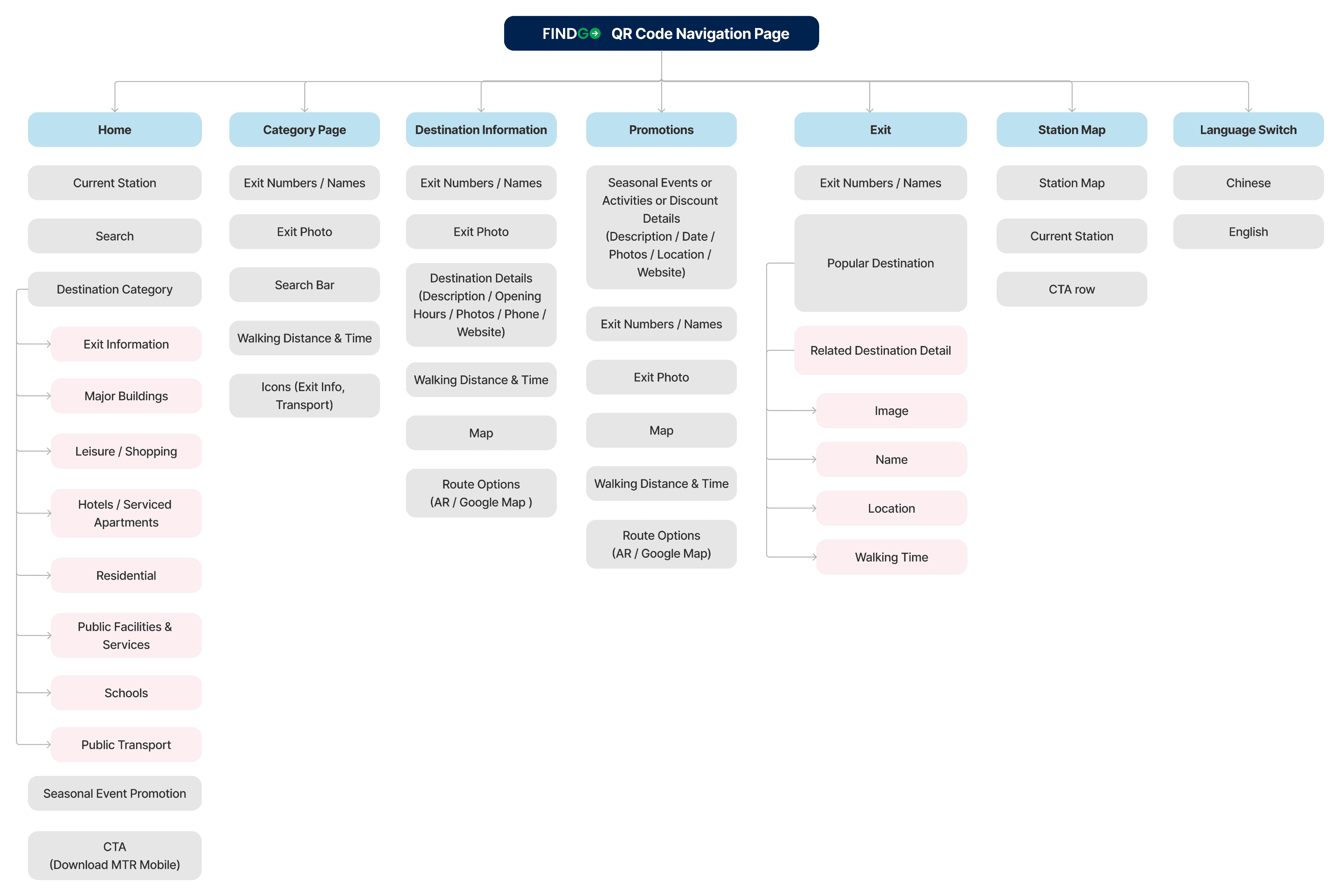
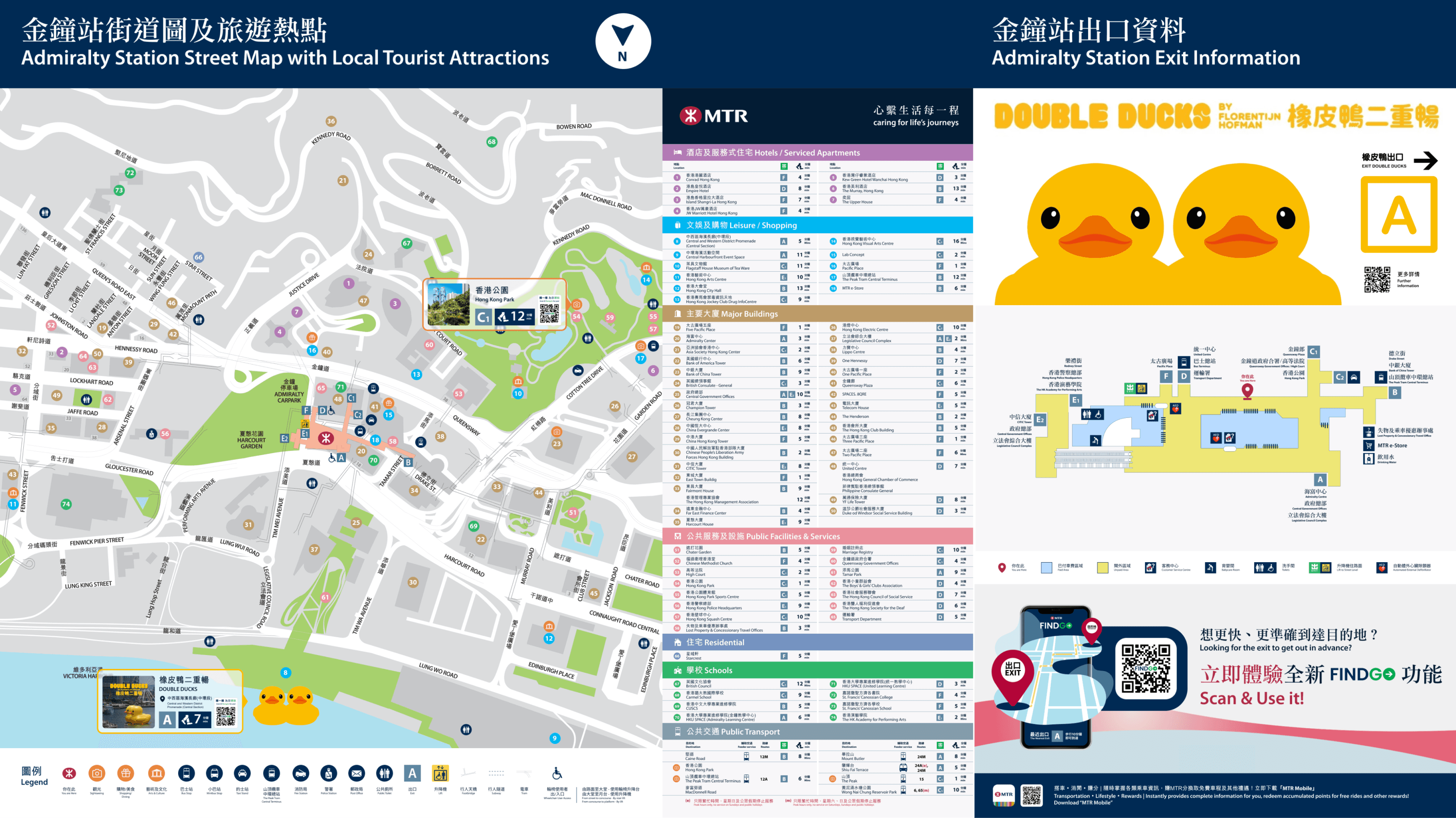
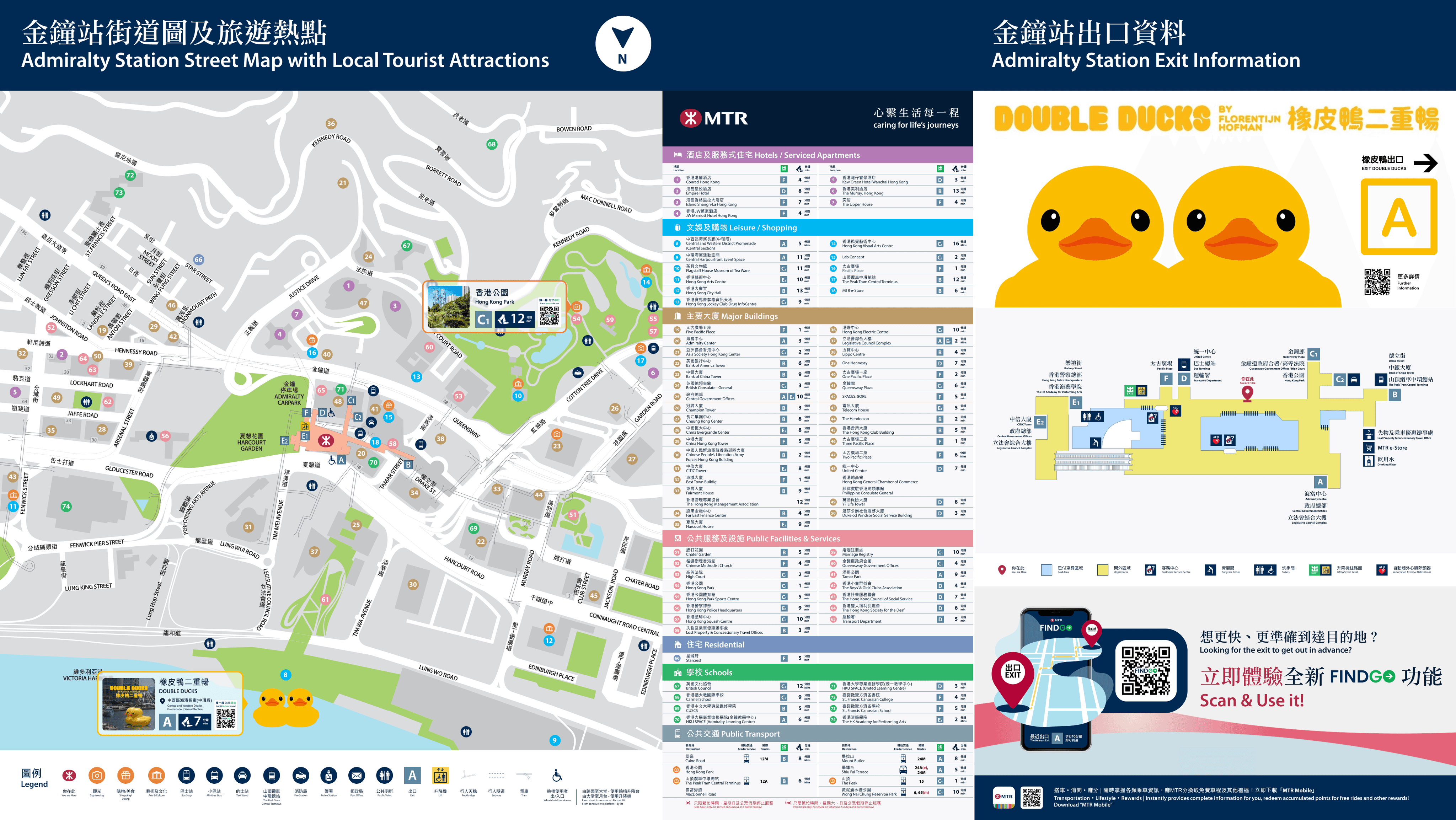
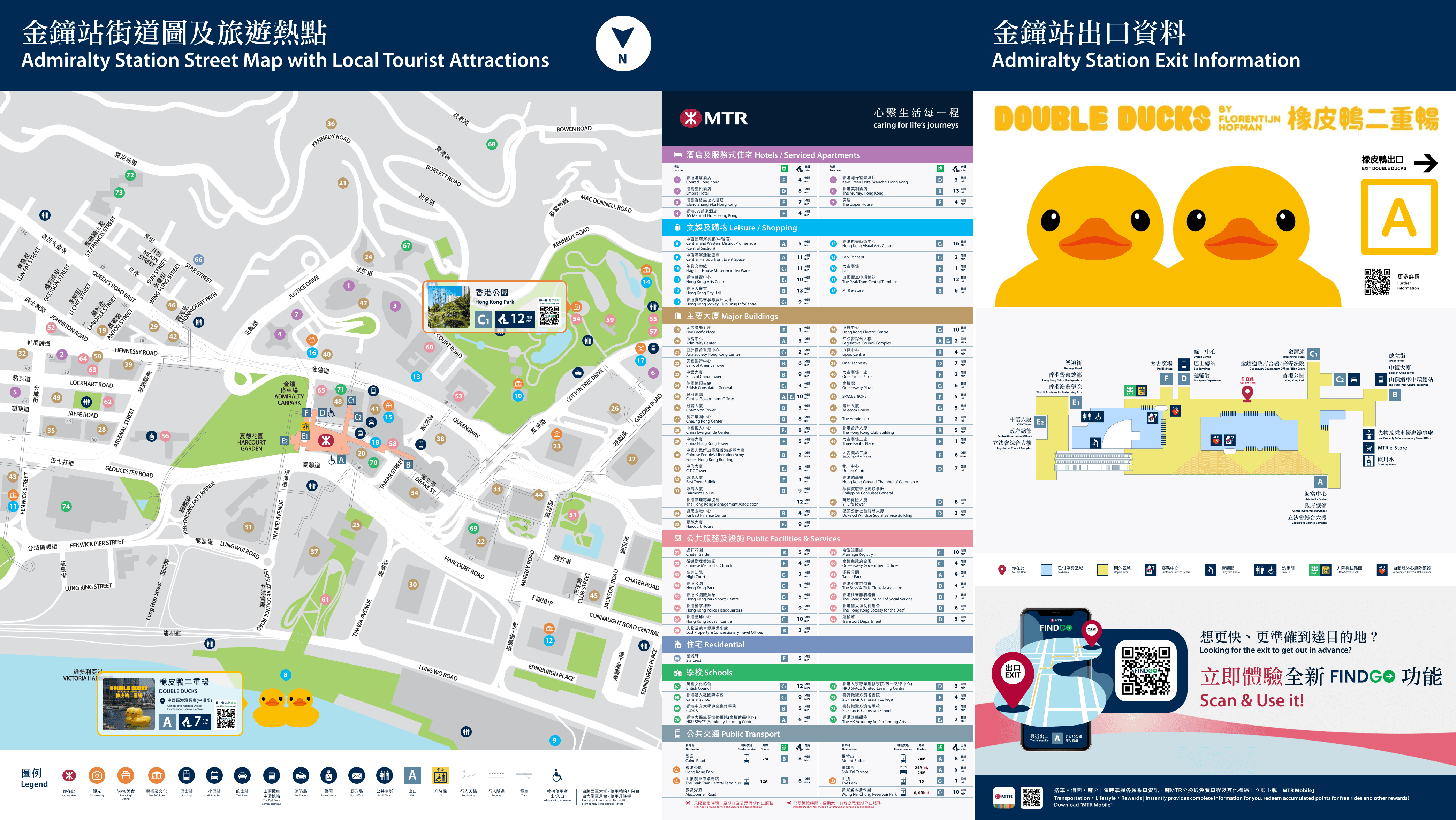
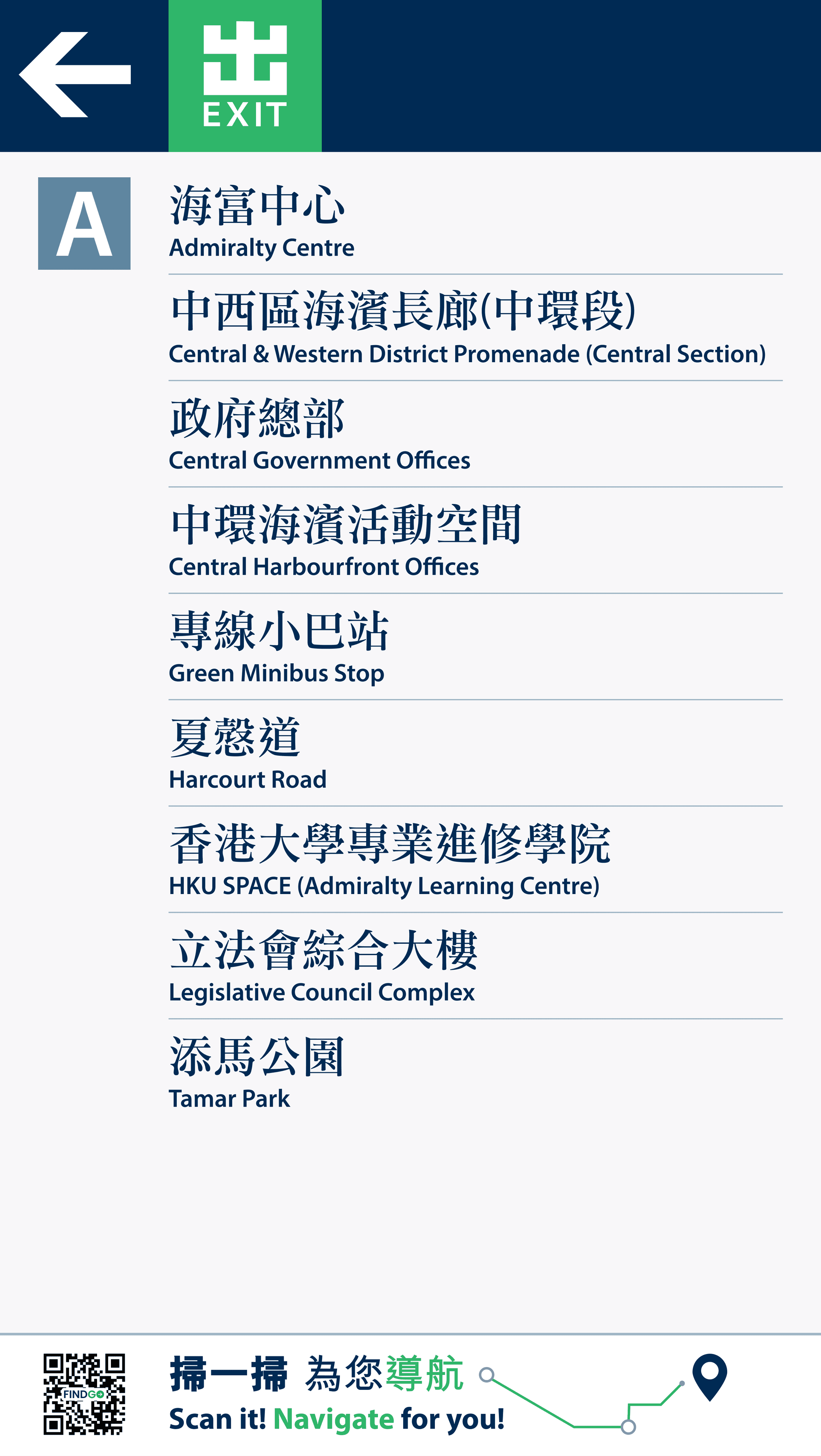
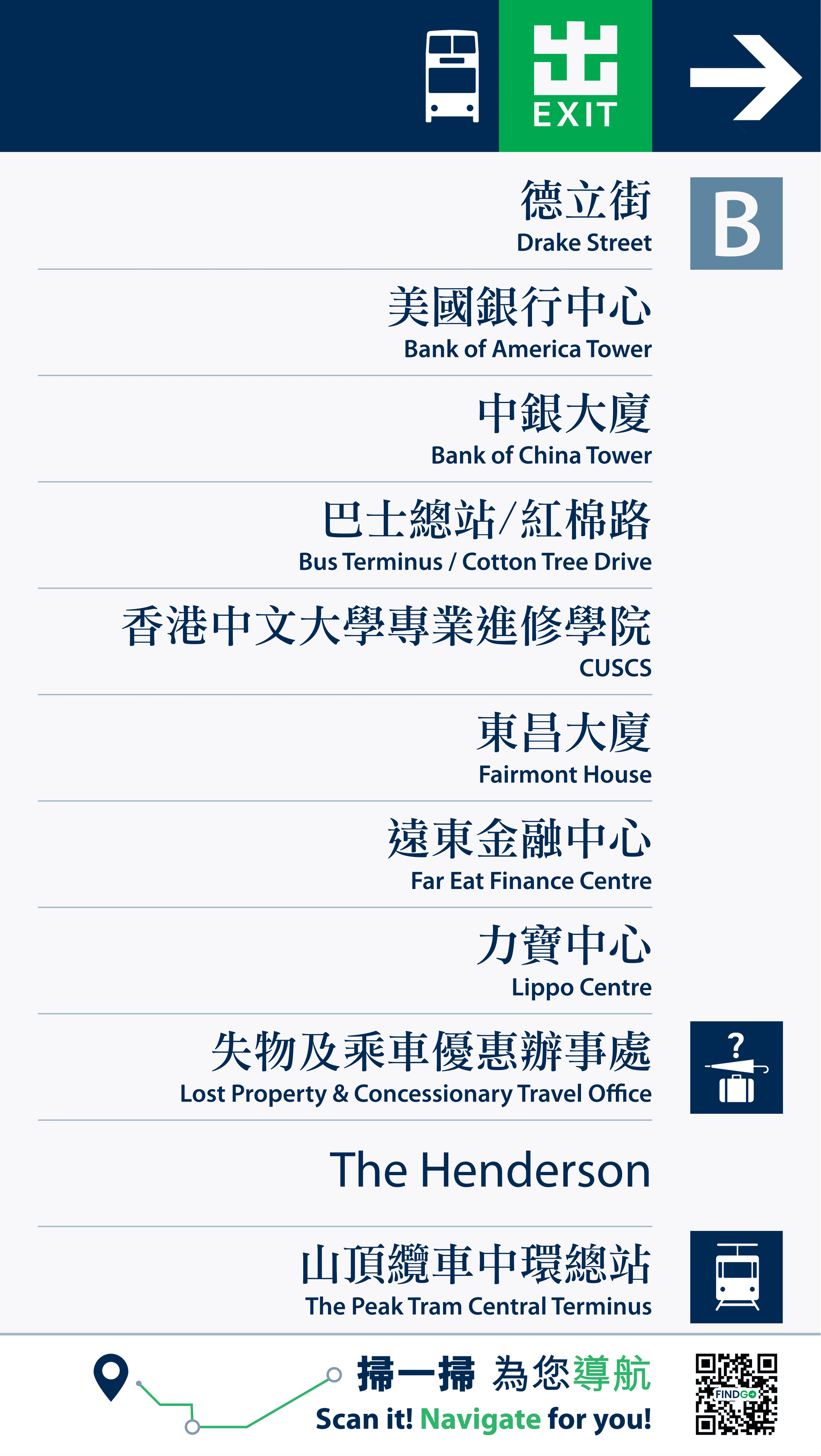
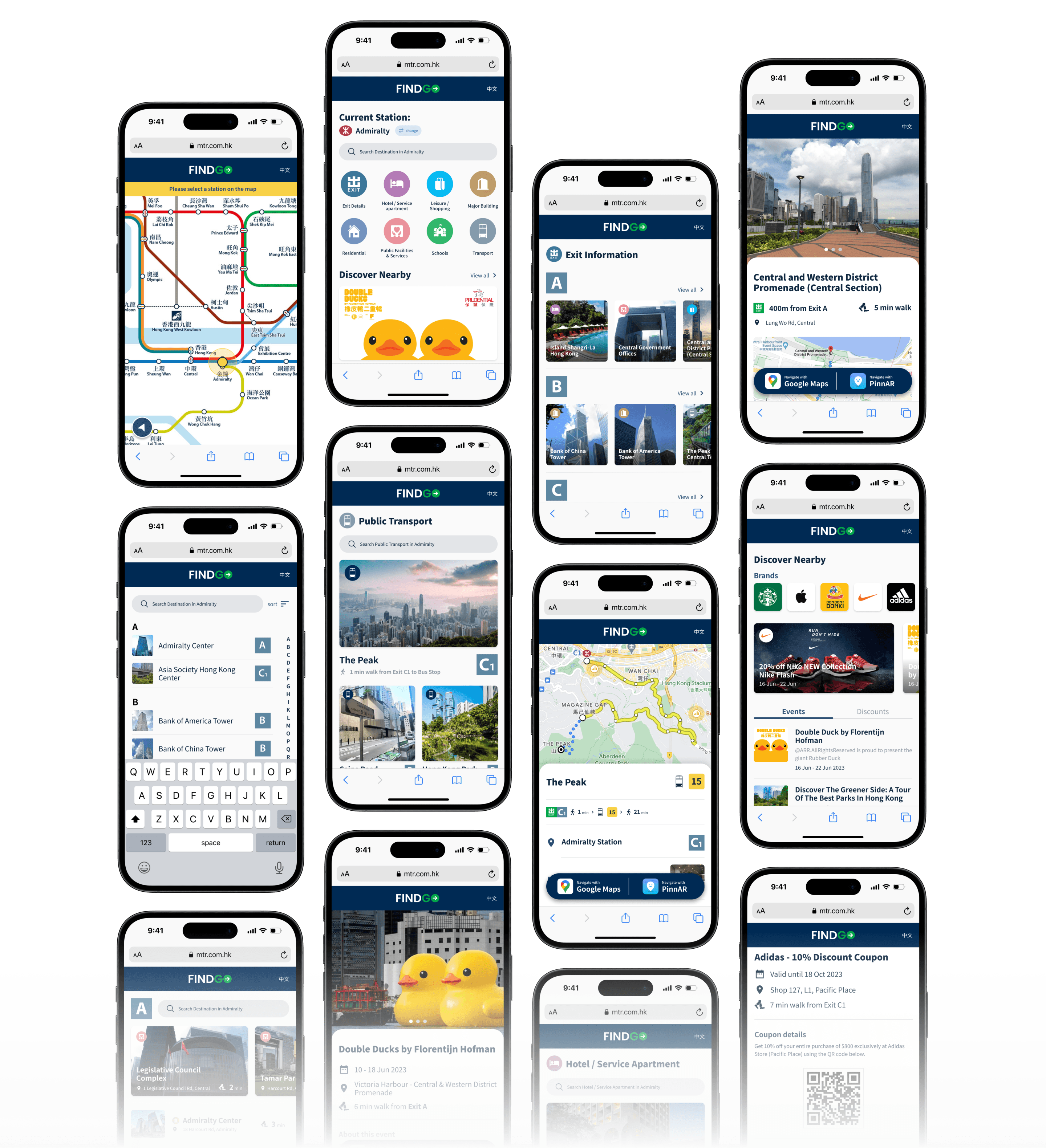
To enhance the wayfinding experience, we leverage the benefits of digitalization. We have digitized the system map and exit directory, and designed a web-based wayfinding assistant - FINDGO. This assistant guides users to their destinations using mobile devices, while also providing real-time information and nearby promotions.
These efforts not only improve management efficiency, but also create opportunities for monetization for MTR.
As a UX/UI Designer
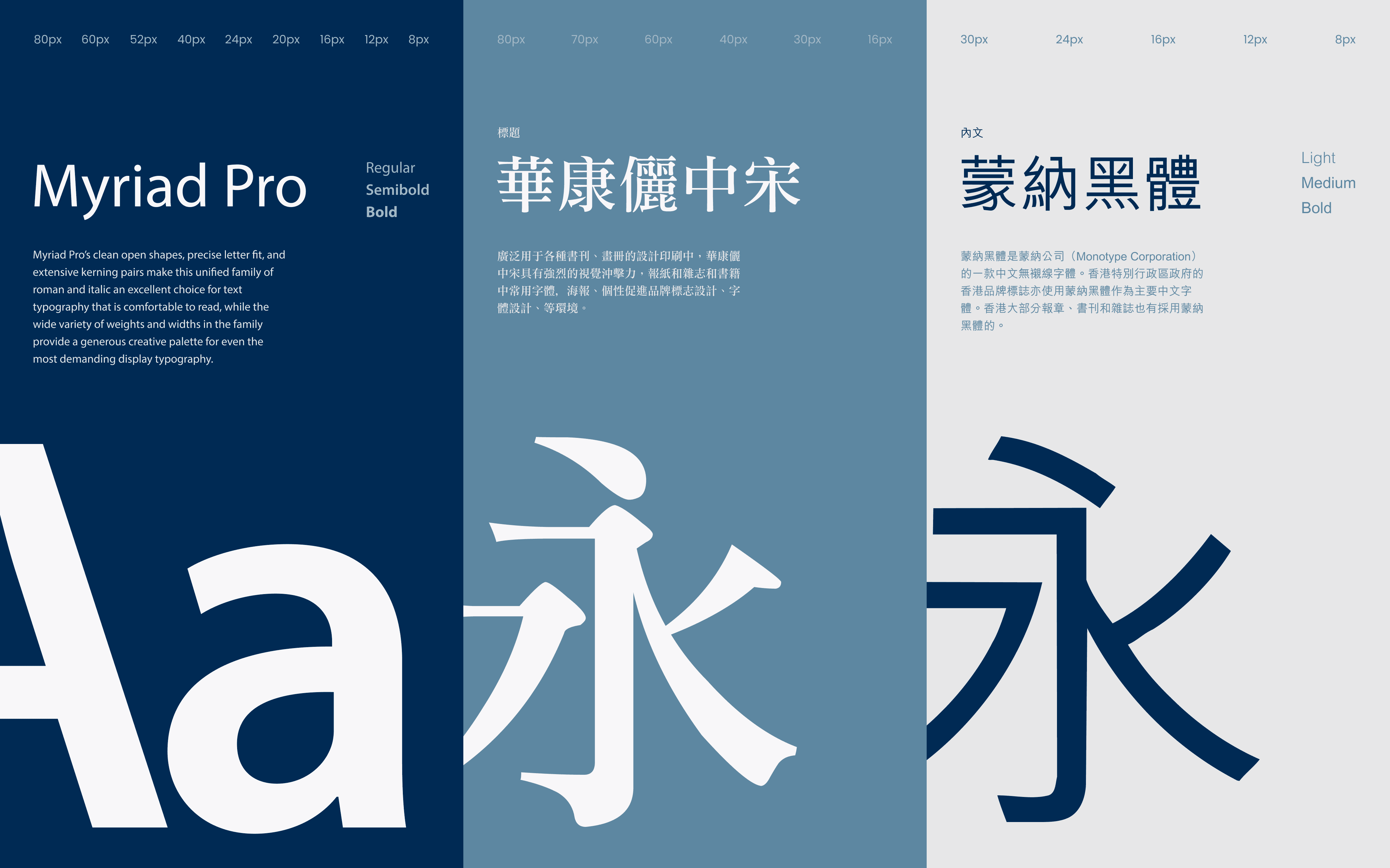
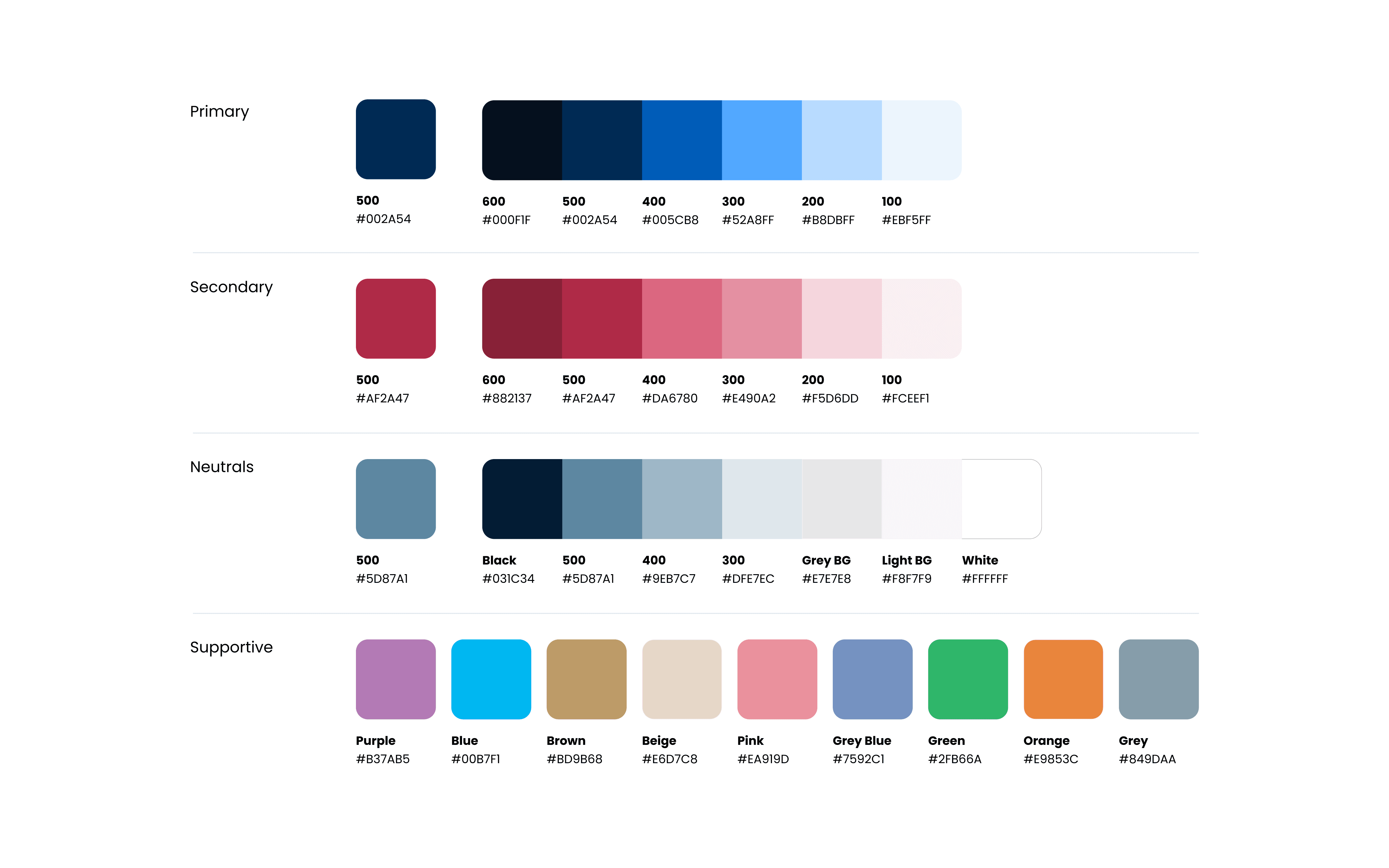
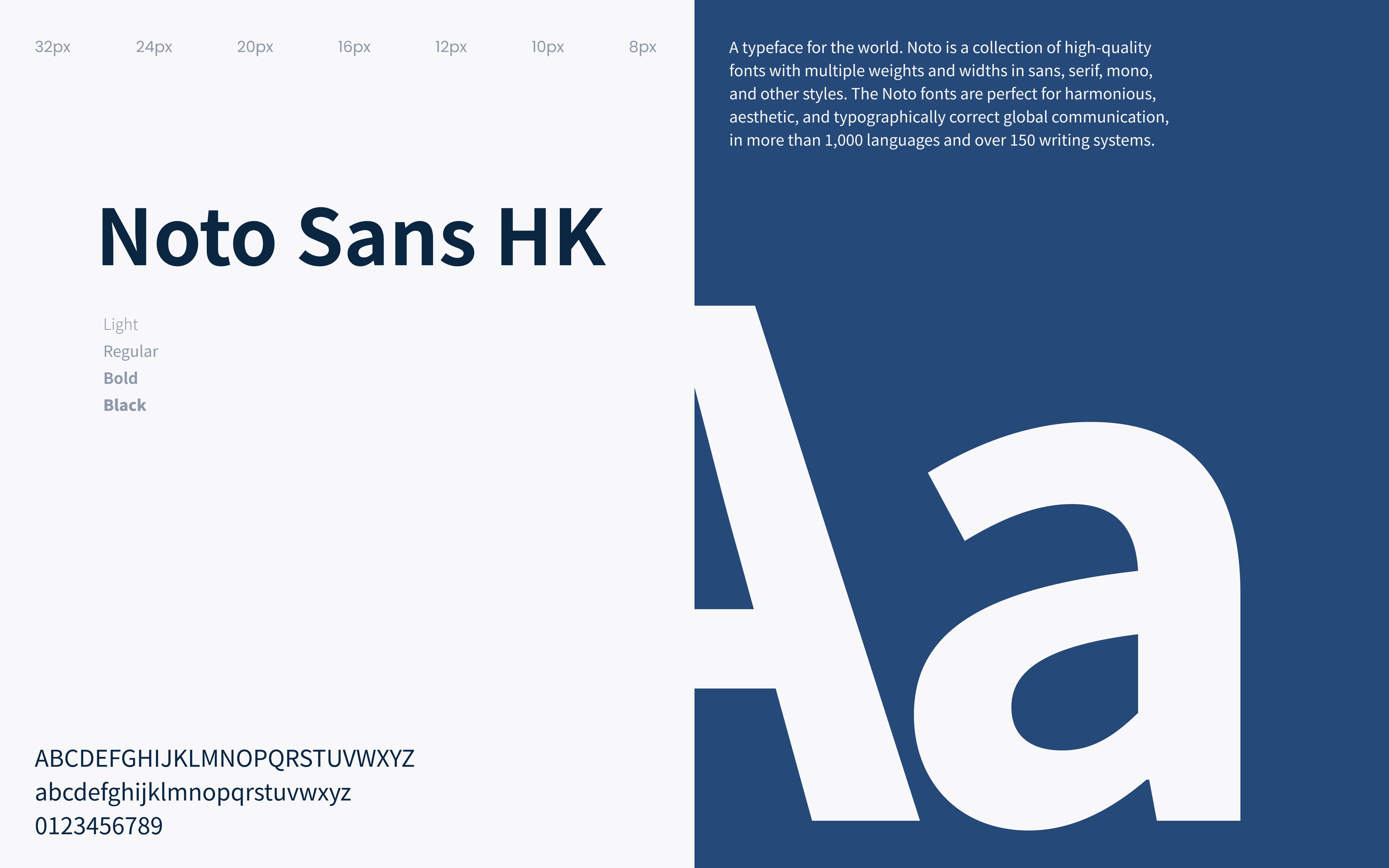
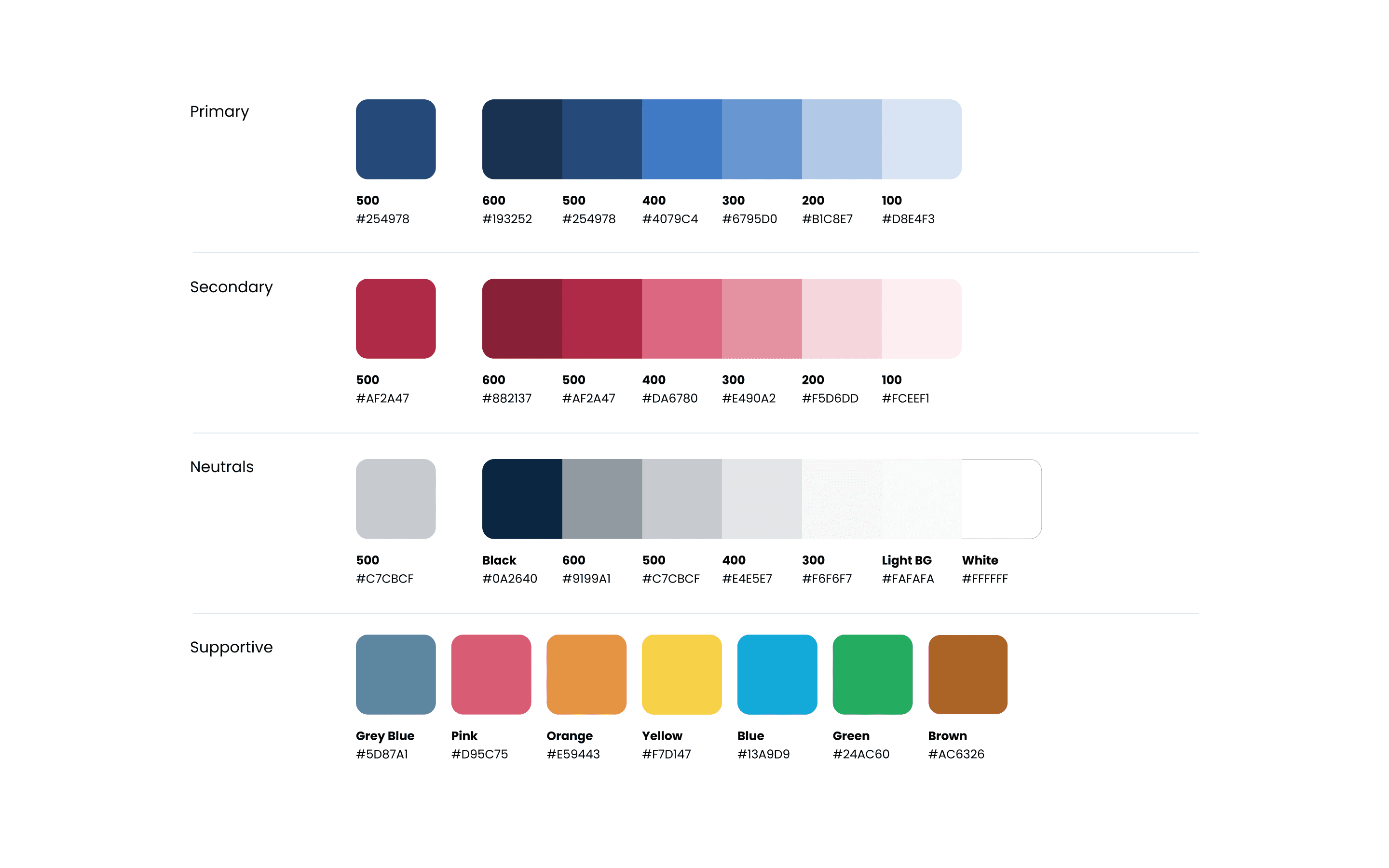
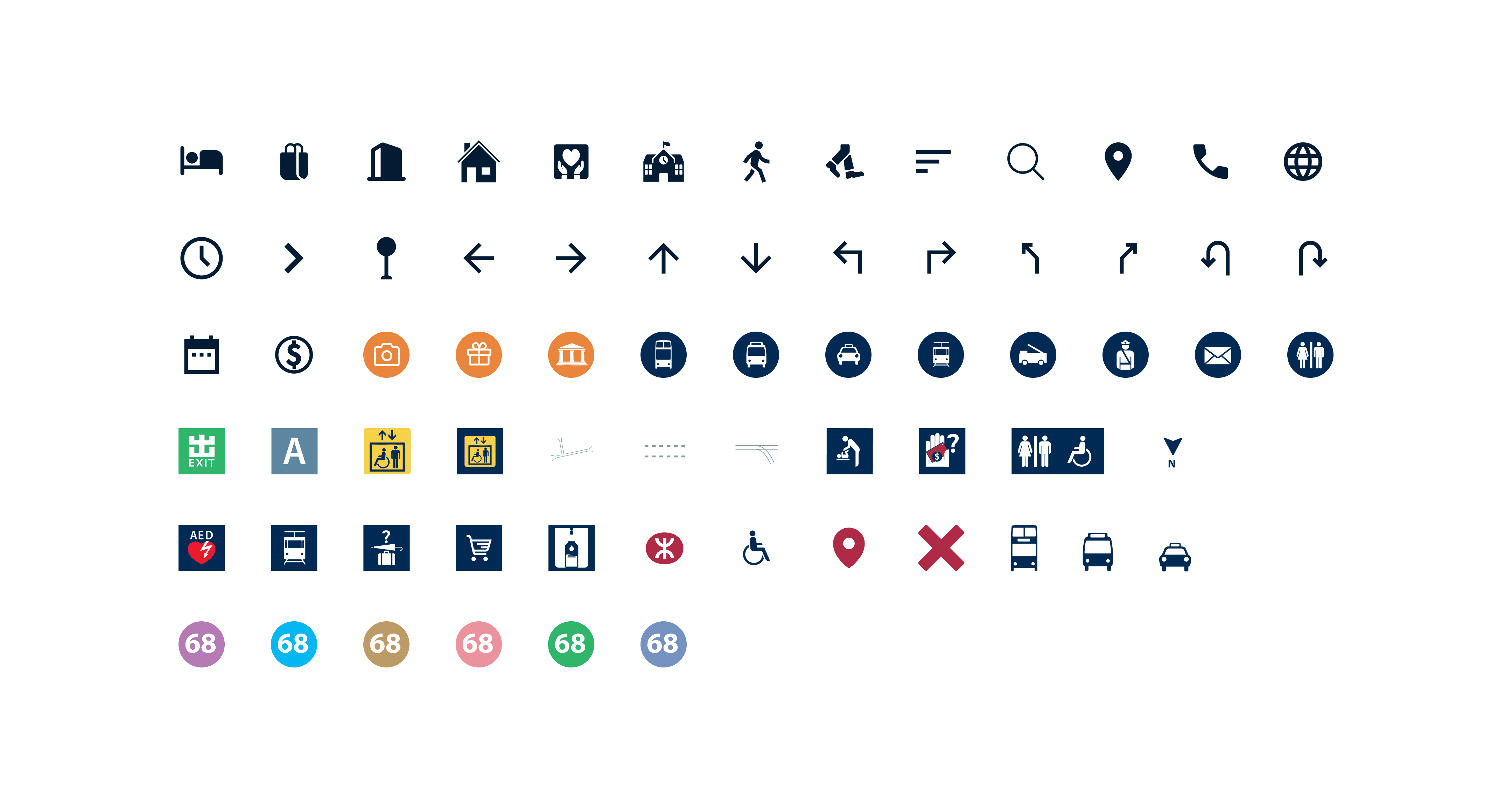
I played a key role in designing part to maintain a consistent visual style for the project, including designing some graphics.
My involvement extended to user research, ideation, wireframing, and usability testing. Furthermore, I contributed to the overall prototype's development and made adjustments based on feedback.
Research & Define
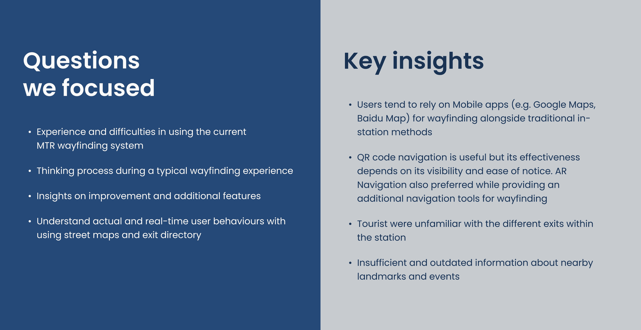
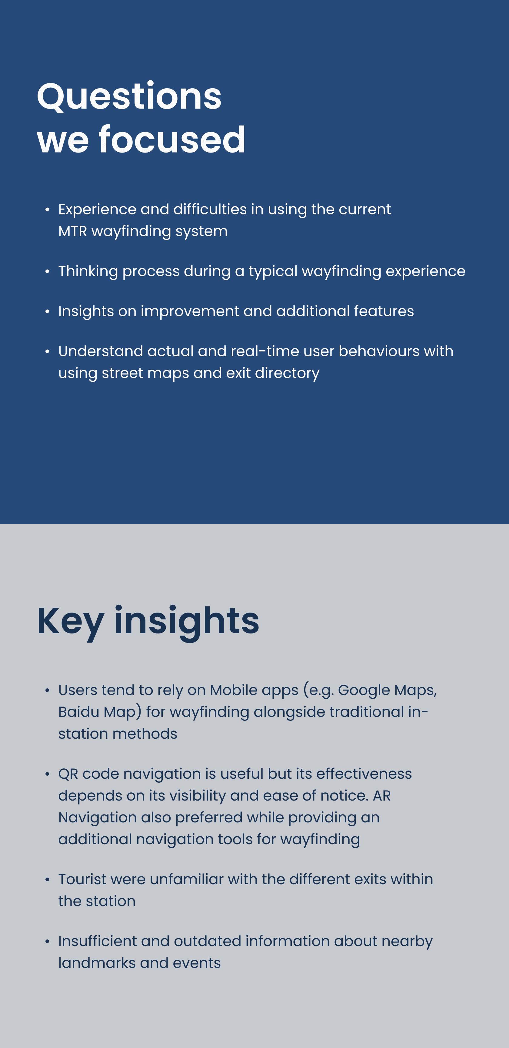
Both secondary and primary research methods are used to identify the pain points and user experiences related to the wayfinding system of MTR stations.
Our research approach includes a combination of user surveys, interviews, and field observations, mainly focusing on Admiralty station. This approach helps clarify project goals, identify design opportunities and constraints, and provides a basis for the subsequent define stage.
WHAT I DID
Secondary Research
Survey
Interview
Field Observation
UI References
User Survey
User Interviews & Field Observation
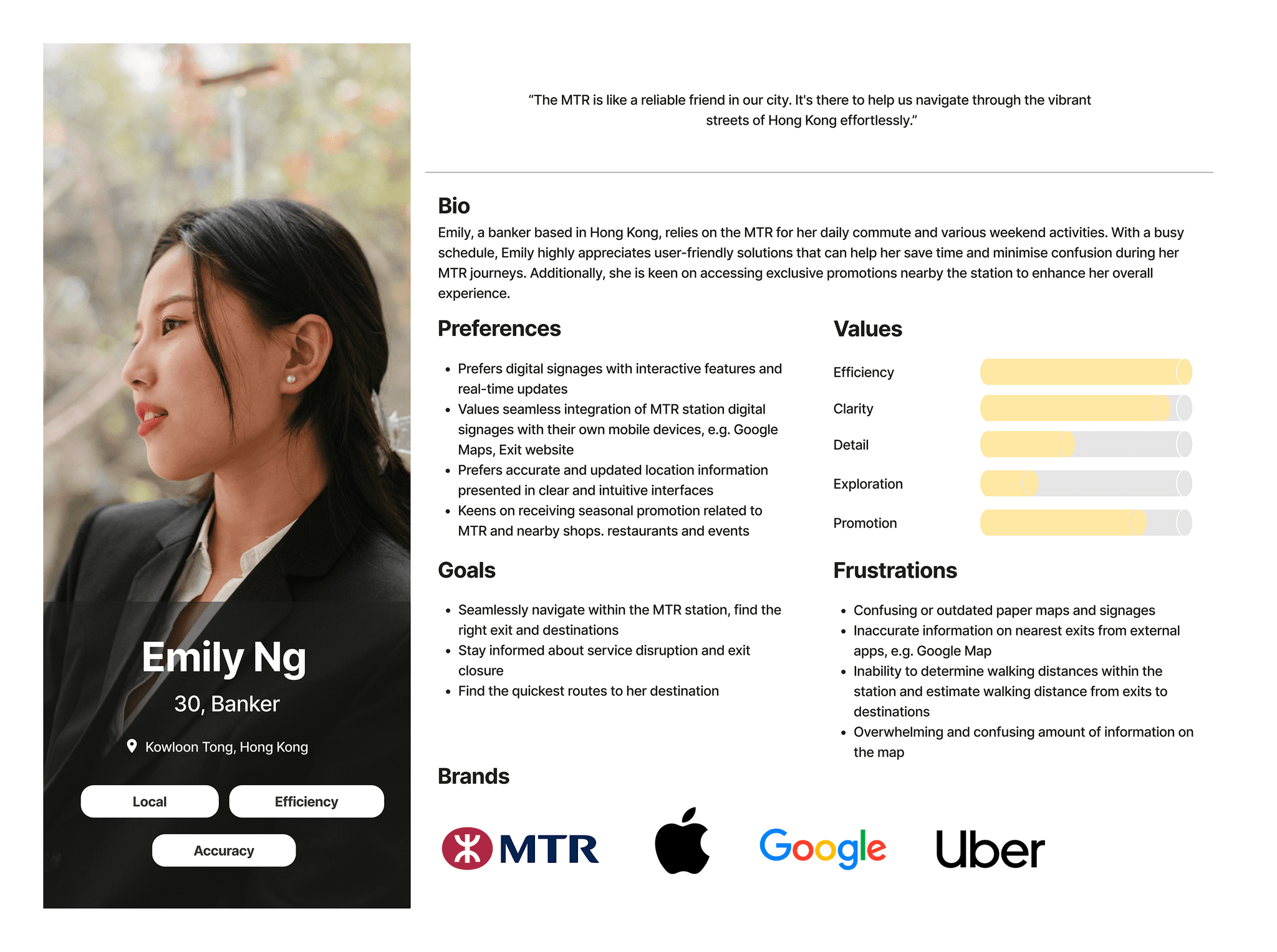
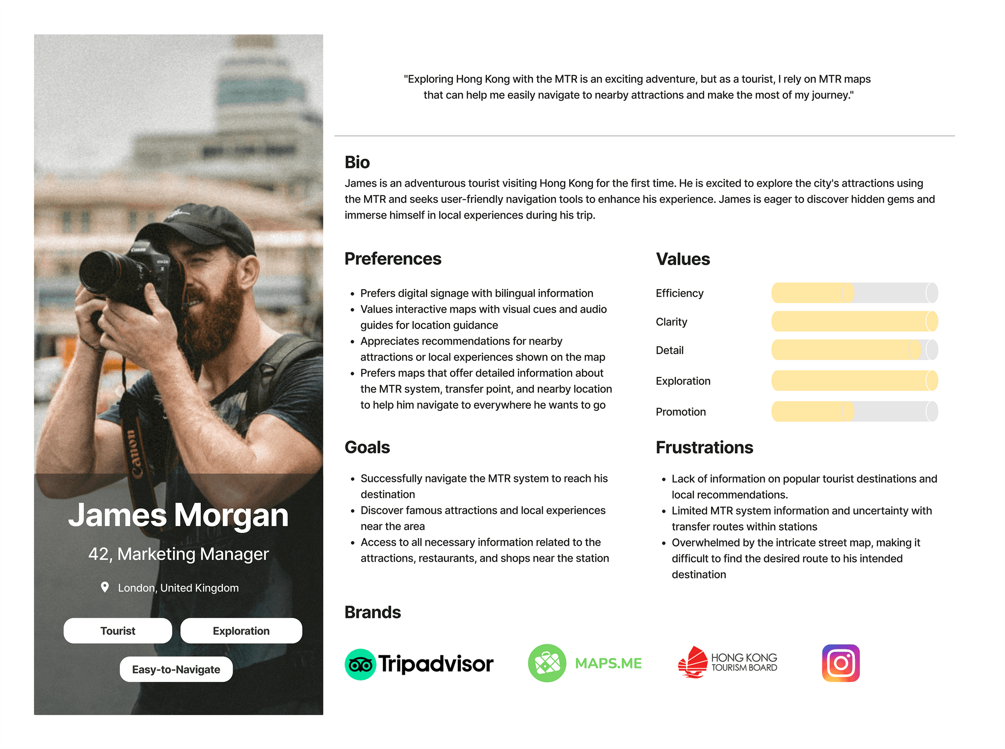
Persona
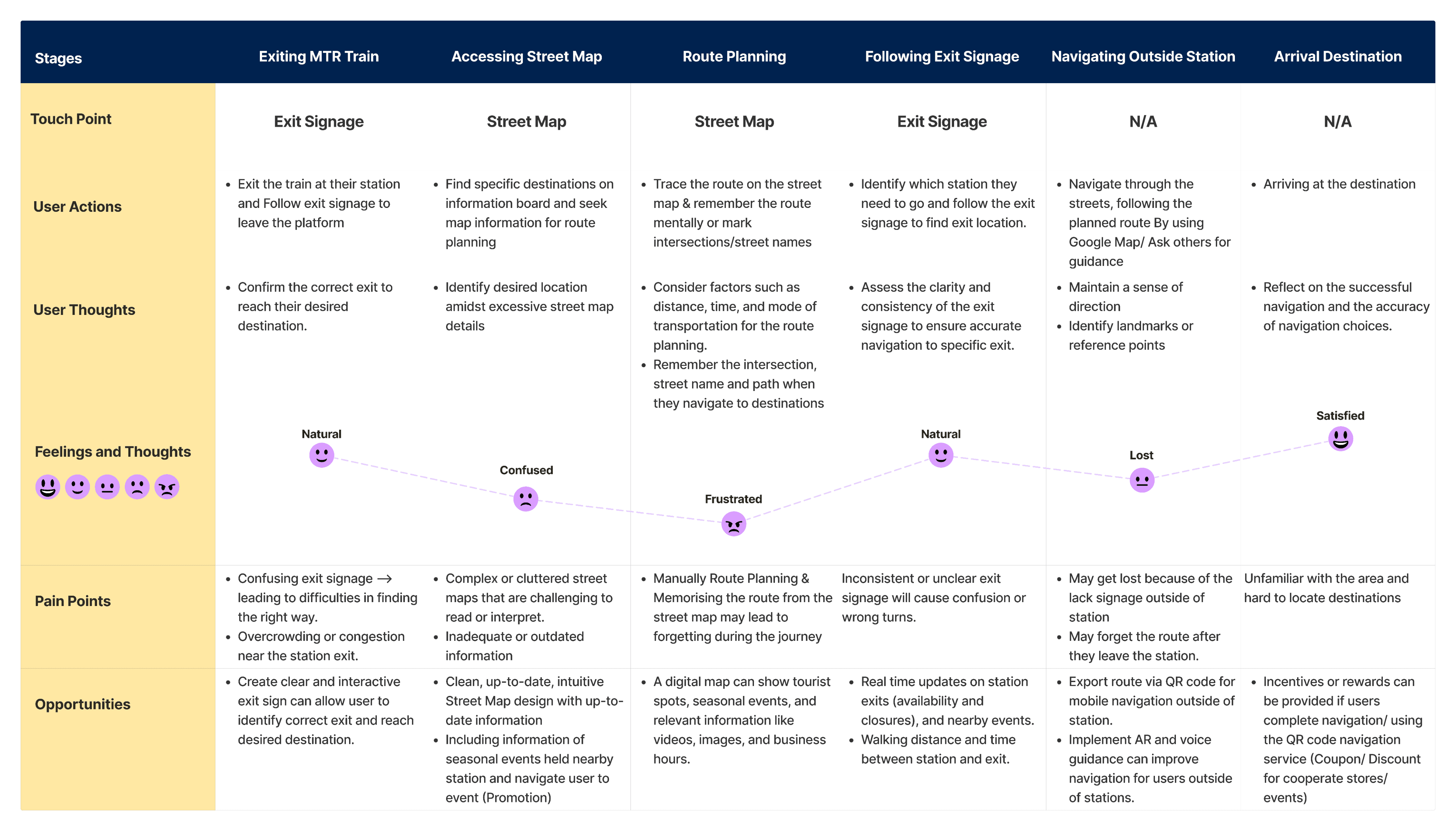
User Journey Map
Limited Client Availability & Constraints on Interactive Design Elements
Challenges in staying in touch with the client made it difficult to communicate effectively. It was hard to find the right balance between giving updates on time and not overwhelming them with too many messages. Additionally, it was challenging to get the necessary information and approvals from the client because of their busy schedule and limited availability.
However, we took a proactive approach to engage with the client. We consistently reached out, offering project updates and progress reports. By keeping the client informed and involved, we ensured that the project continued to make progress, even when they were not available.
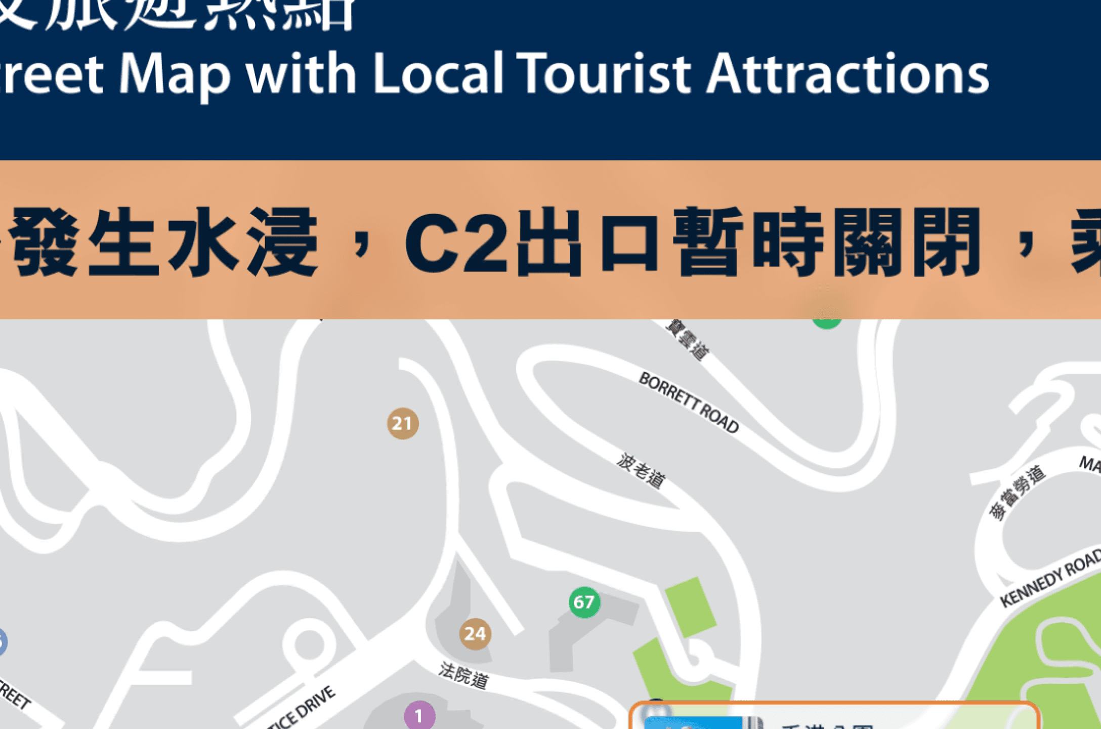
We also faced challenges with interactive design constraints. Initially, we planned to enhance the user experience with touchable and interactive elements on the digital street map, as well as integrating a wayfinding feature into the existing MTR mobile app. However, the client preferred non-touchable designs and requested that we not use the existing app. This forced us to find a way to align with the client's preference while still delivering an engaging and seamless wayfinding experience for users.
How might we use digital signage to enhance MTR users' experience and satisfaction?
How might we effectively share updates about station events and promotions, attracting attention and encouraging participation?
How might we improve wayfinding information and help users navigate exits more easily?
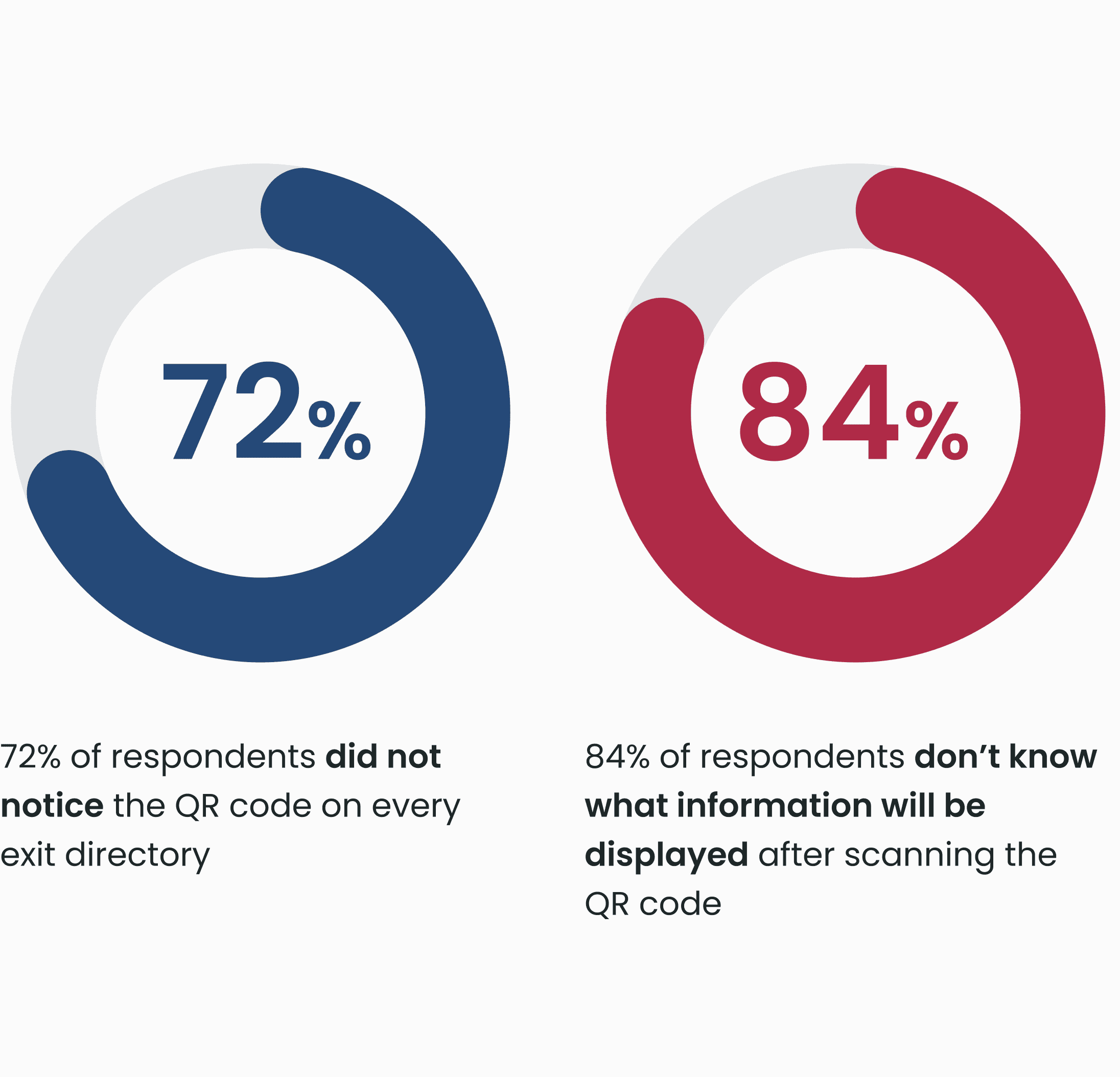
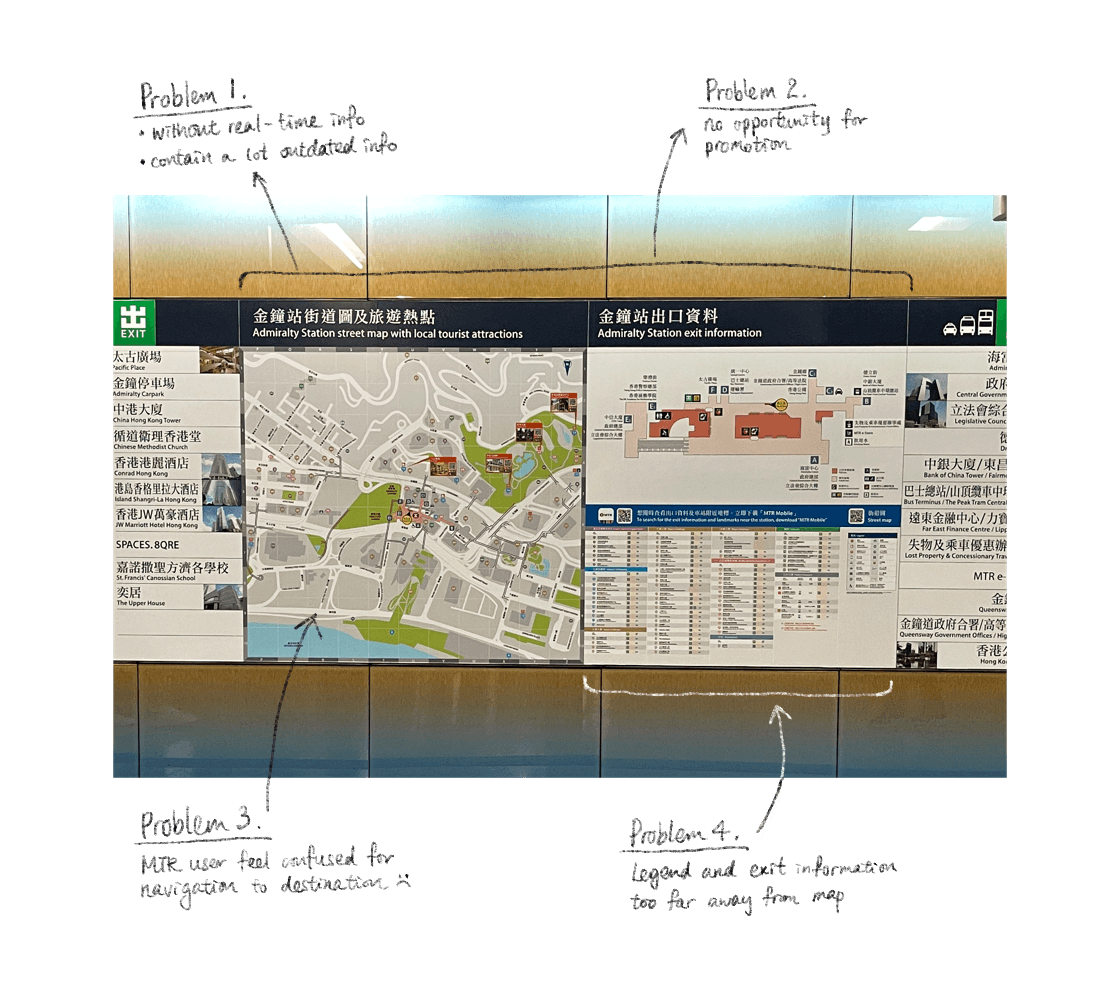
As shown in above, navigating with a static map can be challenging. First of all, without the most updated information and a clear call to action (CTA), the QR code doesn't do much for MTR user. They are unsure of what to scan for navigation, which is a critical problem.
Ideate Solution #1
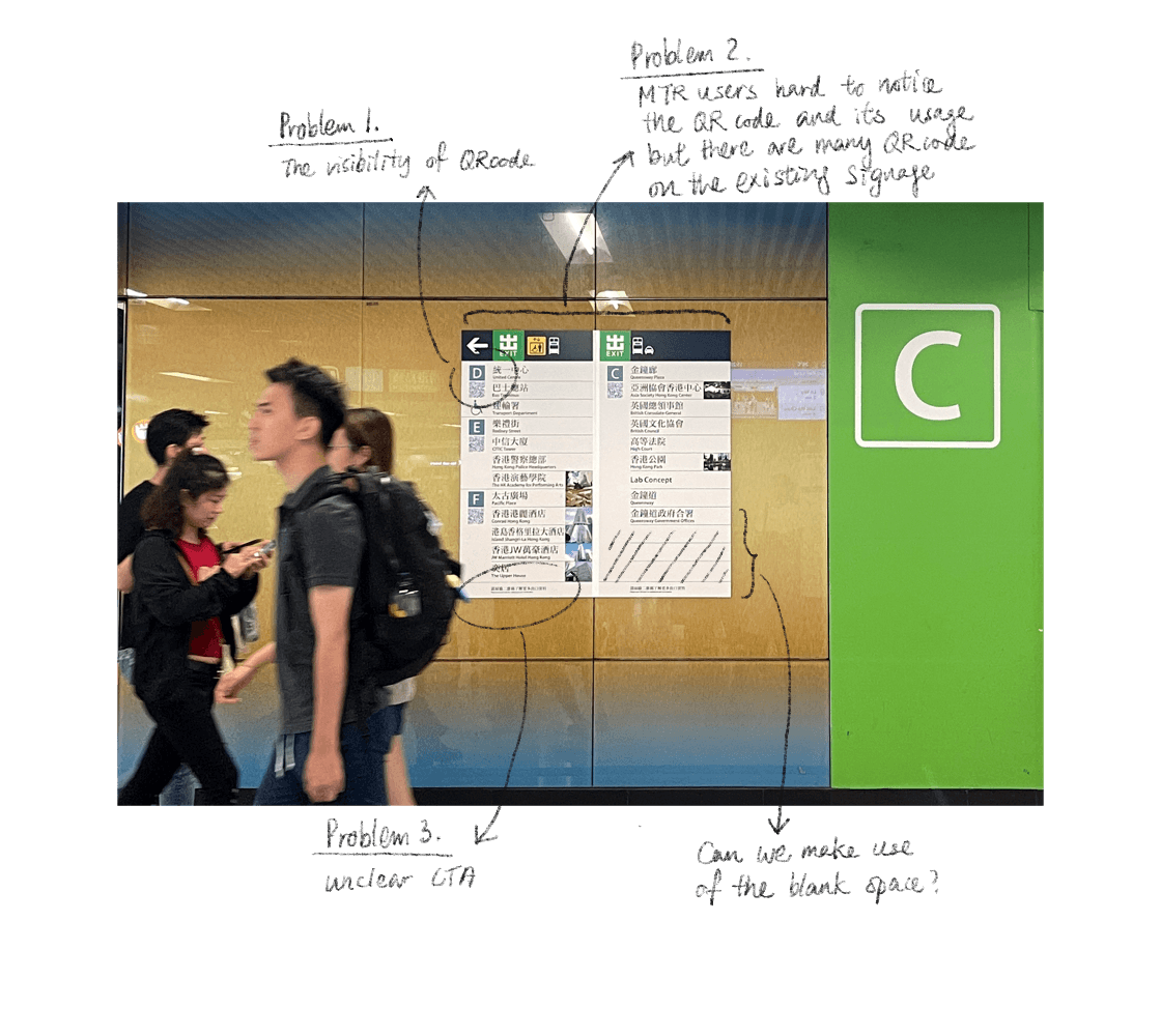
As shown above, the critical problem similar to the system map with an unclear CTA. The QR code doesn't provide much value for MTR users. And I think we can utilize the blank space for a special promotional design.
Ideate Solution #2
Incorporating themes from seasonal events to attract attention, create visual interest, and encourage active participation from users.
Enhancing the visibility of QR code and clearly stating their purpose for scanning, aiming to provide a more seamless and informative navigation experience.
Ideate Solution #3
It aims to improve navigation experience by providing accurate and timely information, addressing the issue of confusion and frustration among users.
Design
Usability Test
To evaluate the user experience of wayfinding, we conducted a usability test. The purpose of the test was to assess the overall usability and experience of the digital system map, Exit directory Display, and FINDGO wayfinding assistant. 6 local commuters took part in the test.
Aim to assess the clarity, accessibility, and ease of information retrieval in our digital products through user feedback and analysis of their cognitive process. This evaluation will involve examining the digital system map, digital exit directory display, and FINDGO wayfinding assistant.
The task involves finding bus routes, locating exits, and assessing navigating effectiveness in MTR stations. This includes identifying difficulties, obstacles, and areas for improvement in the process.
The task includes finding events and destinations in specific areas and evaluating the impact of adding seasonal event promotions on the user experience.
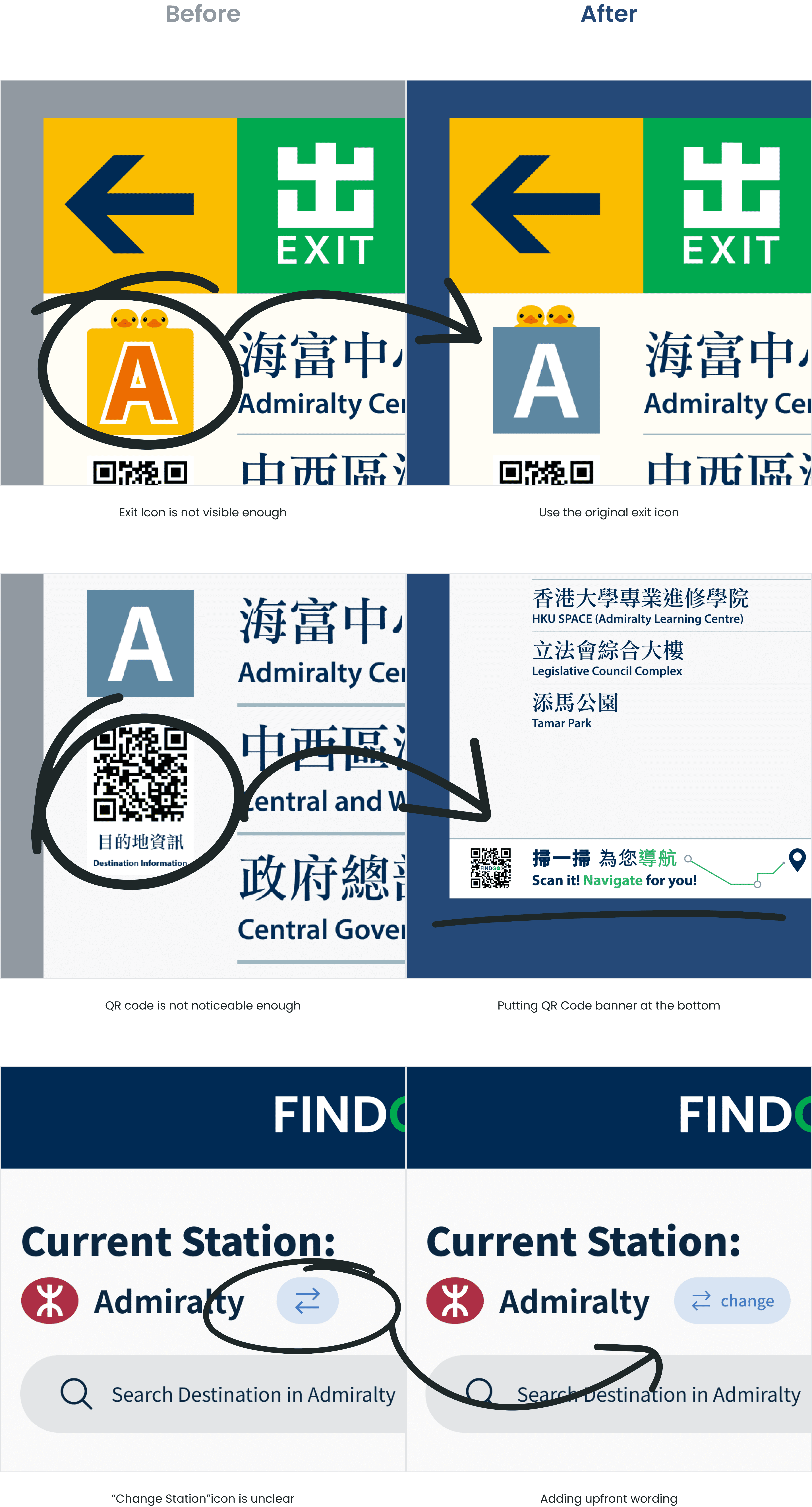
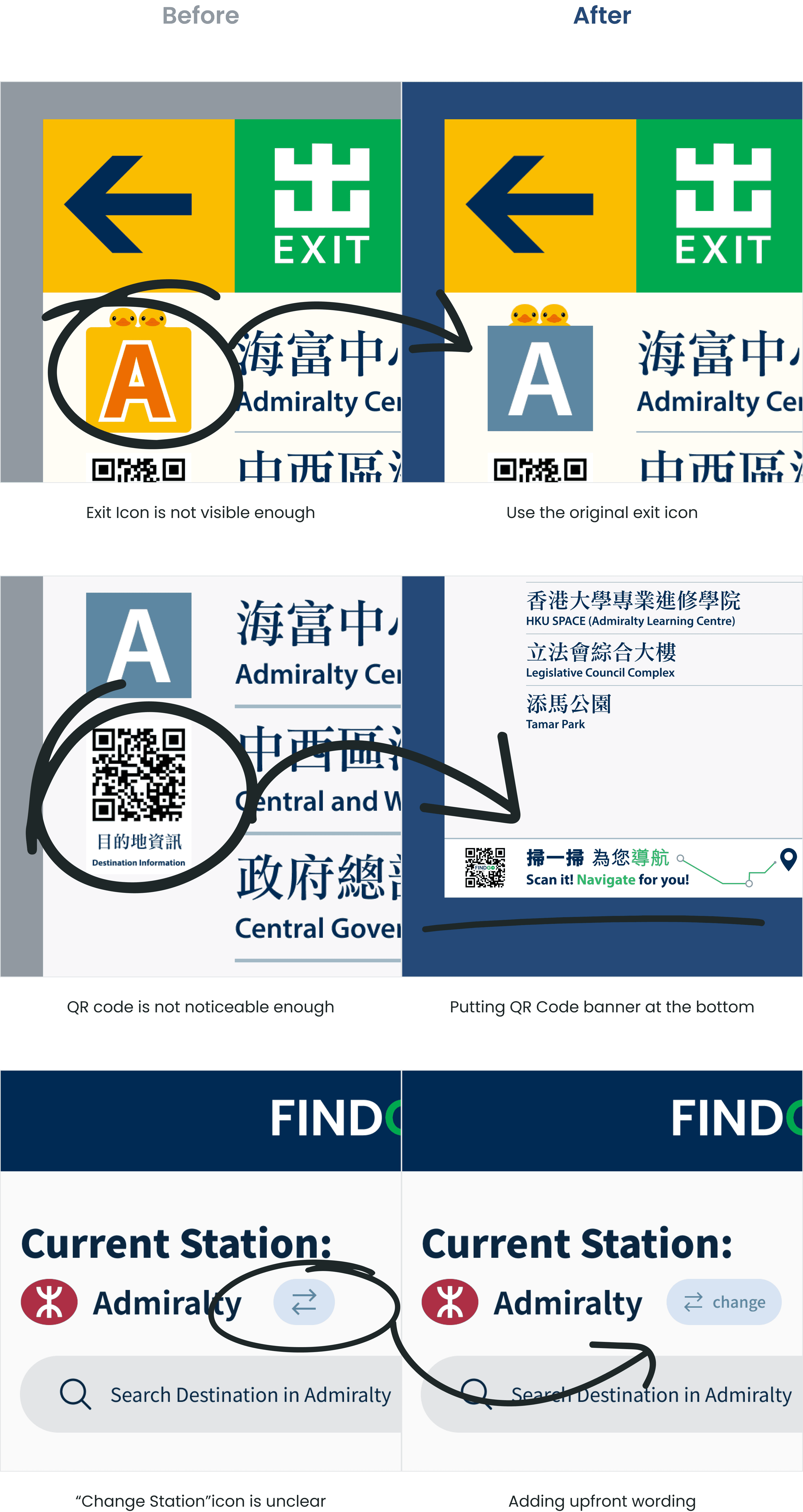
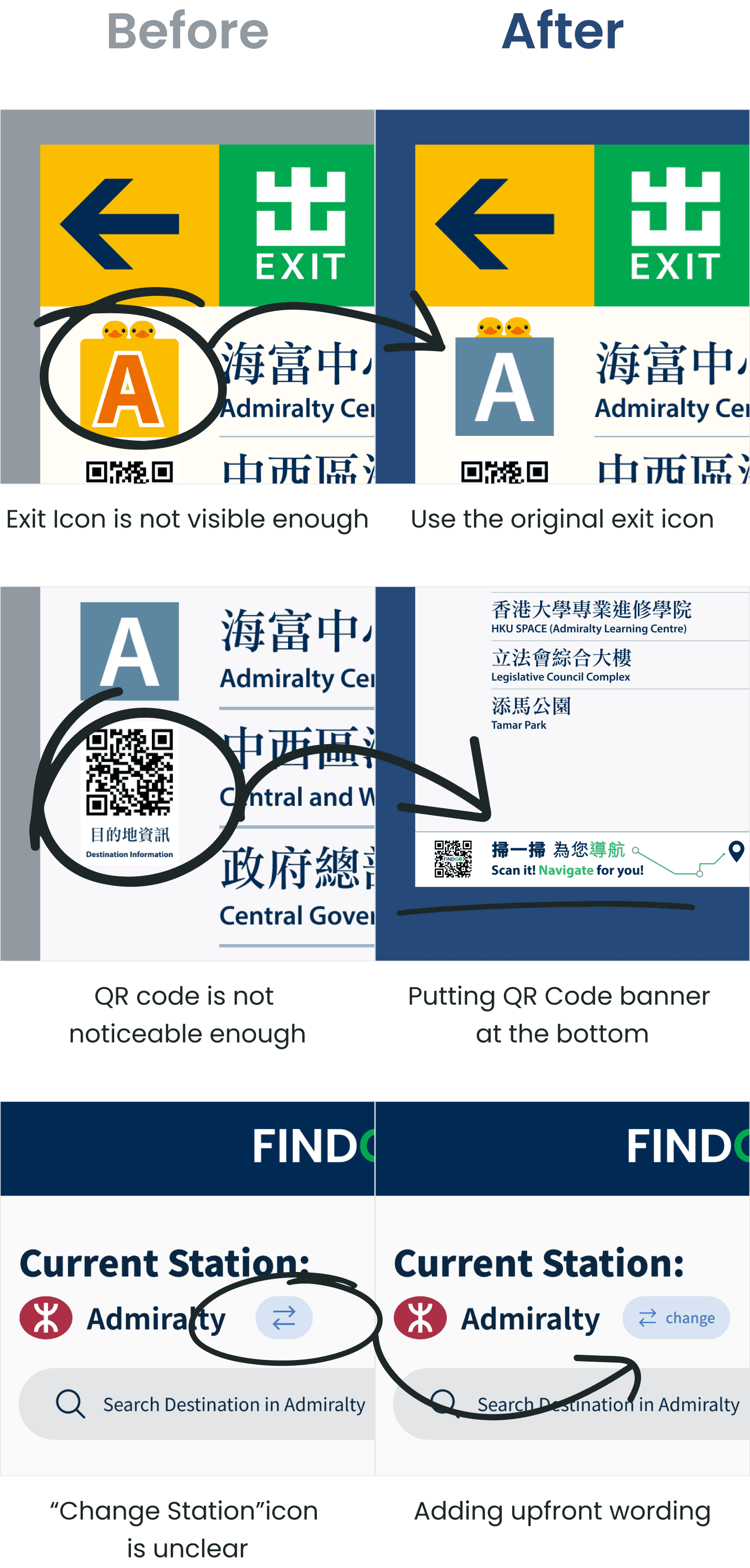
After gathering all the test results, we organised them in an affinity diagram. The overall feedback on navigation and usability was mostly positive. Users found the FINDGO navigation page intuitive, and they appreciated the event promotion and nearby shops section. However, we did identify some design issues. To address the visibility problem, I made necessary adjustments based on the feedback.
Final Product #2
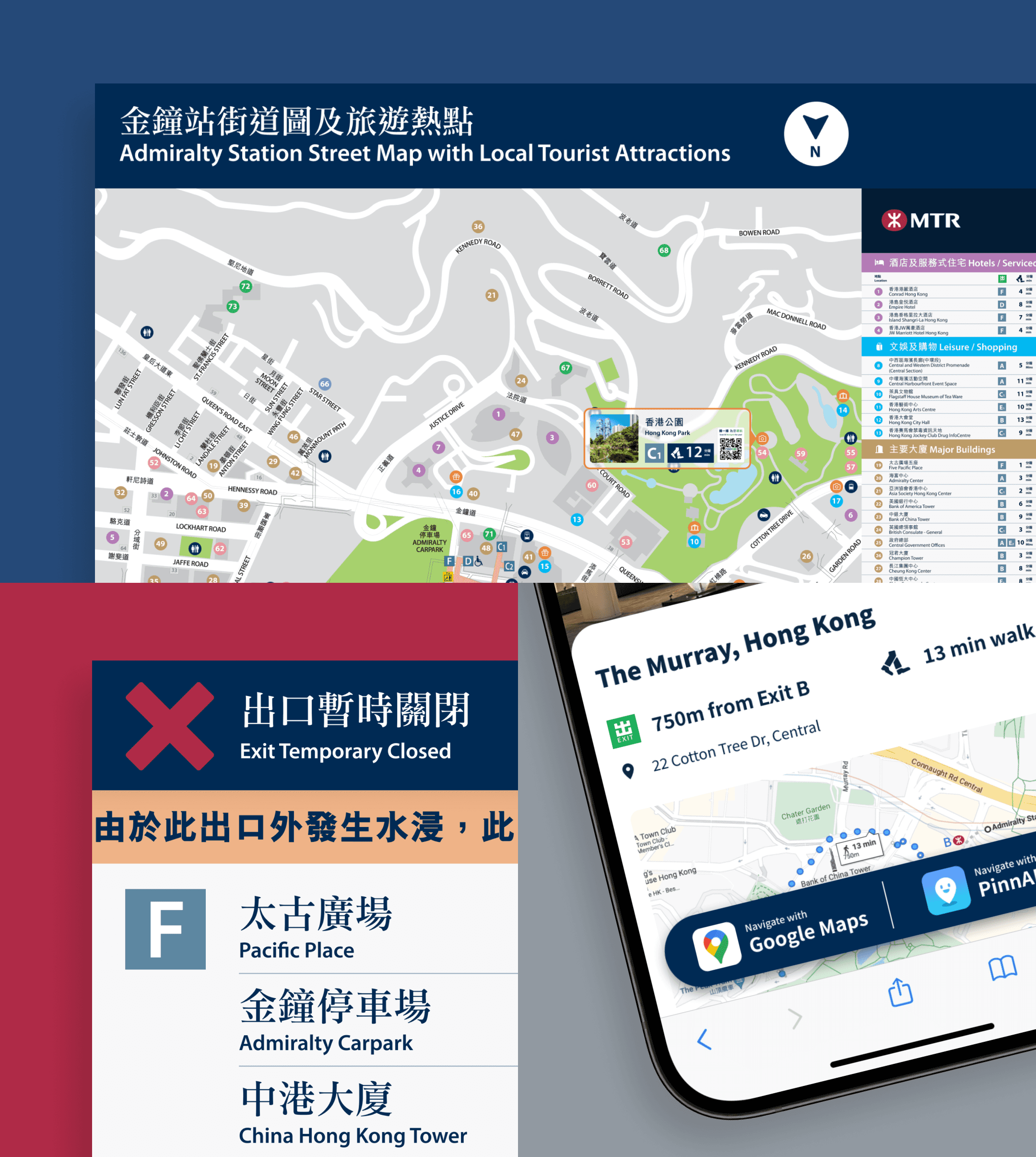
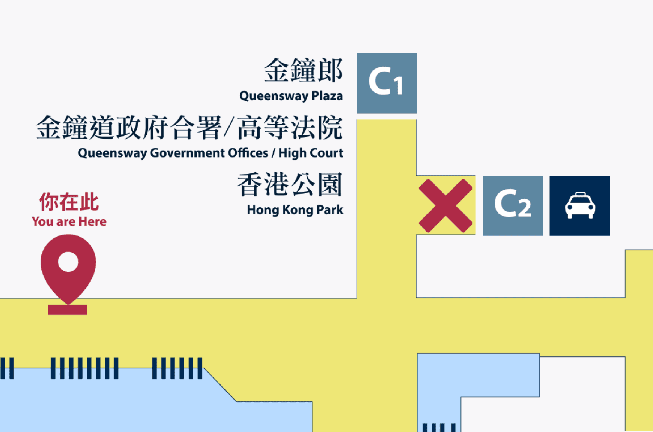
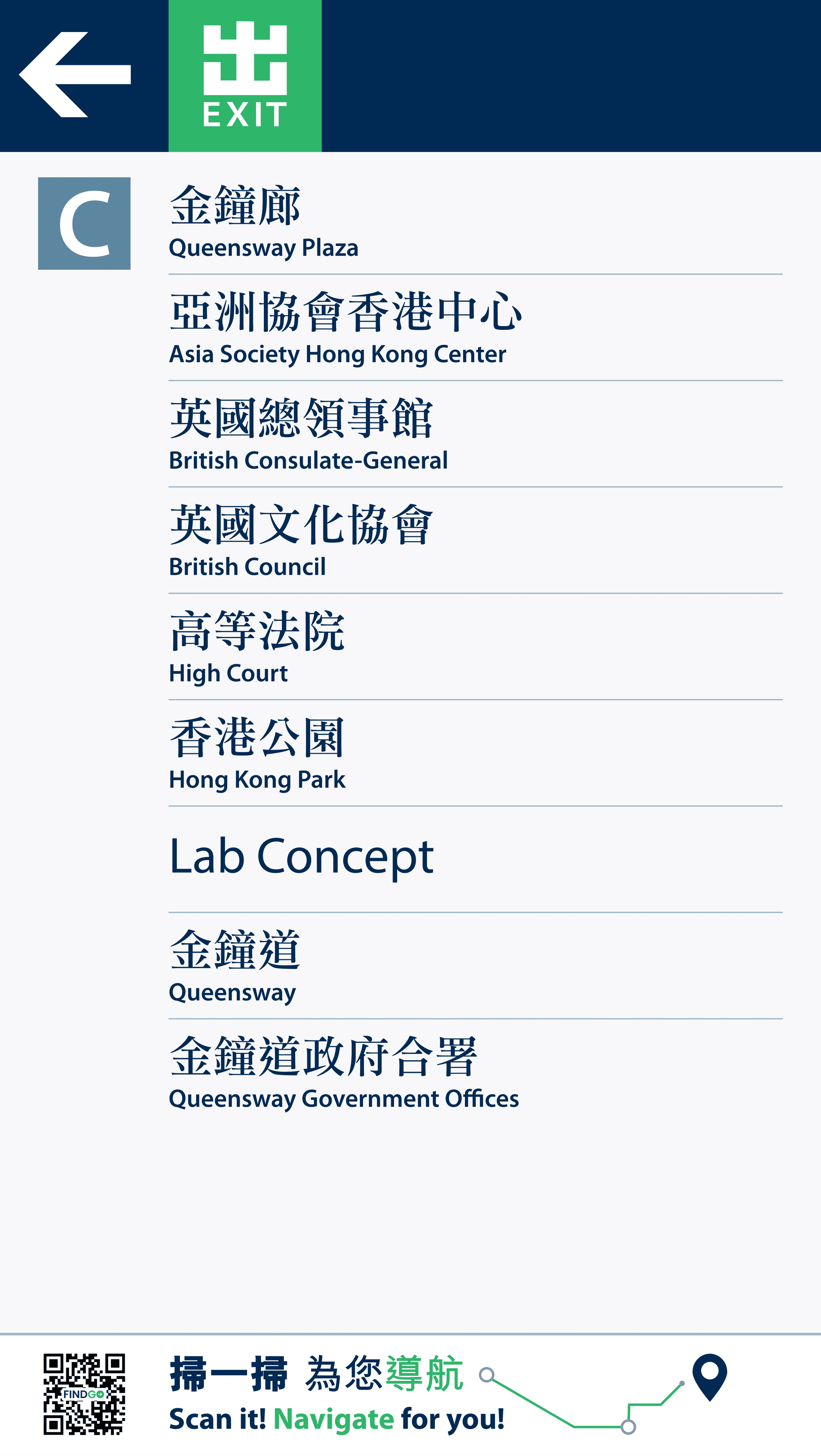
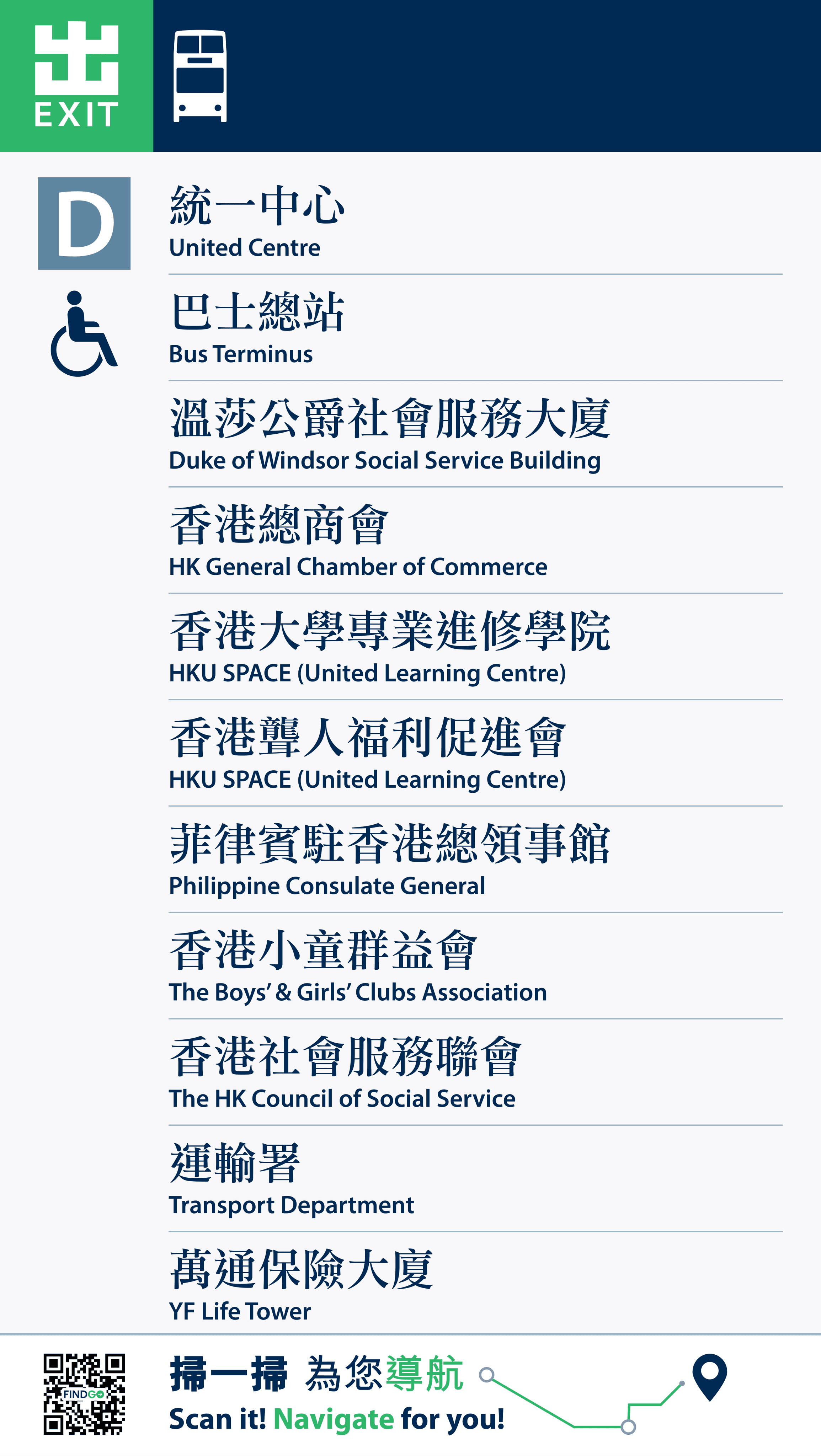
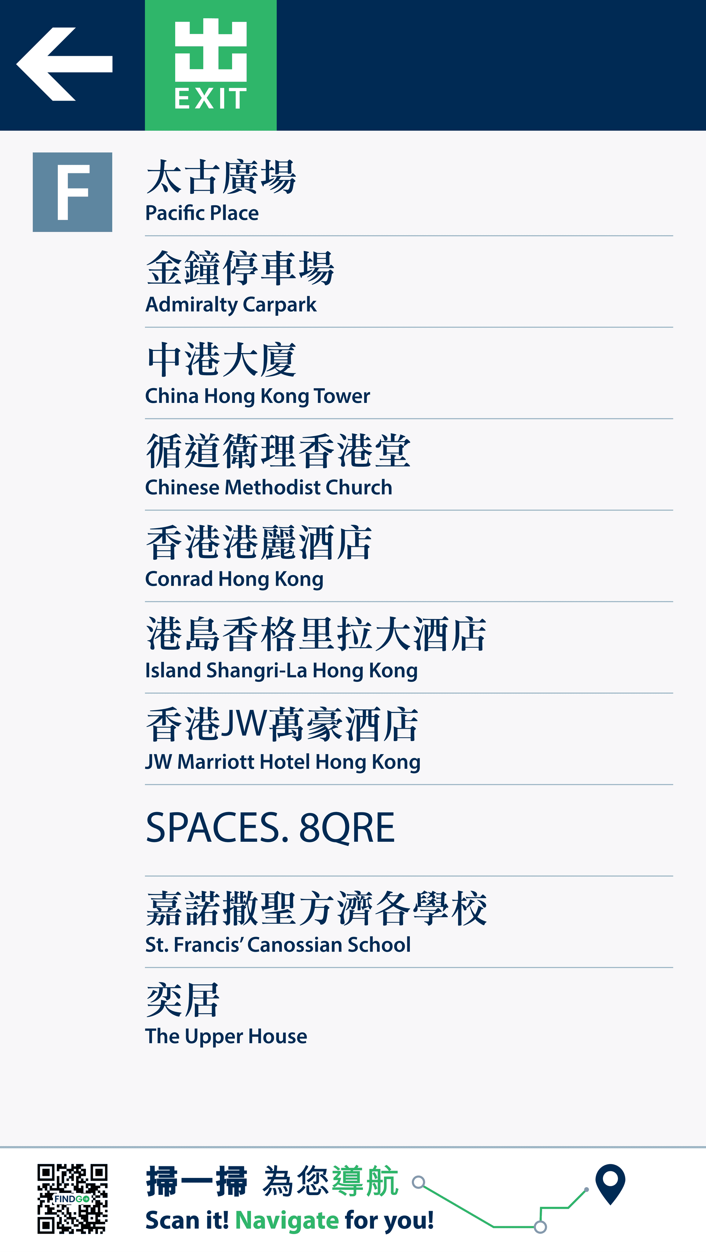
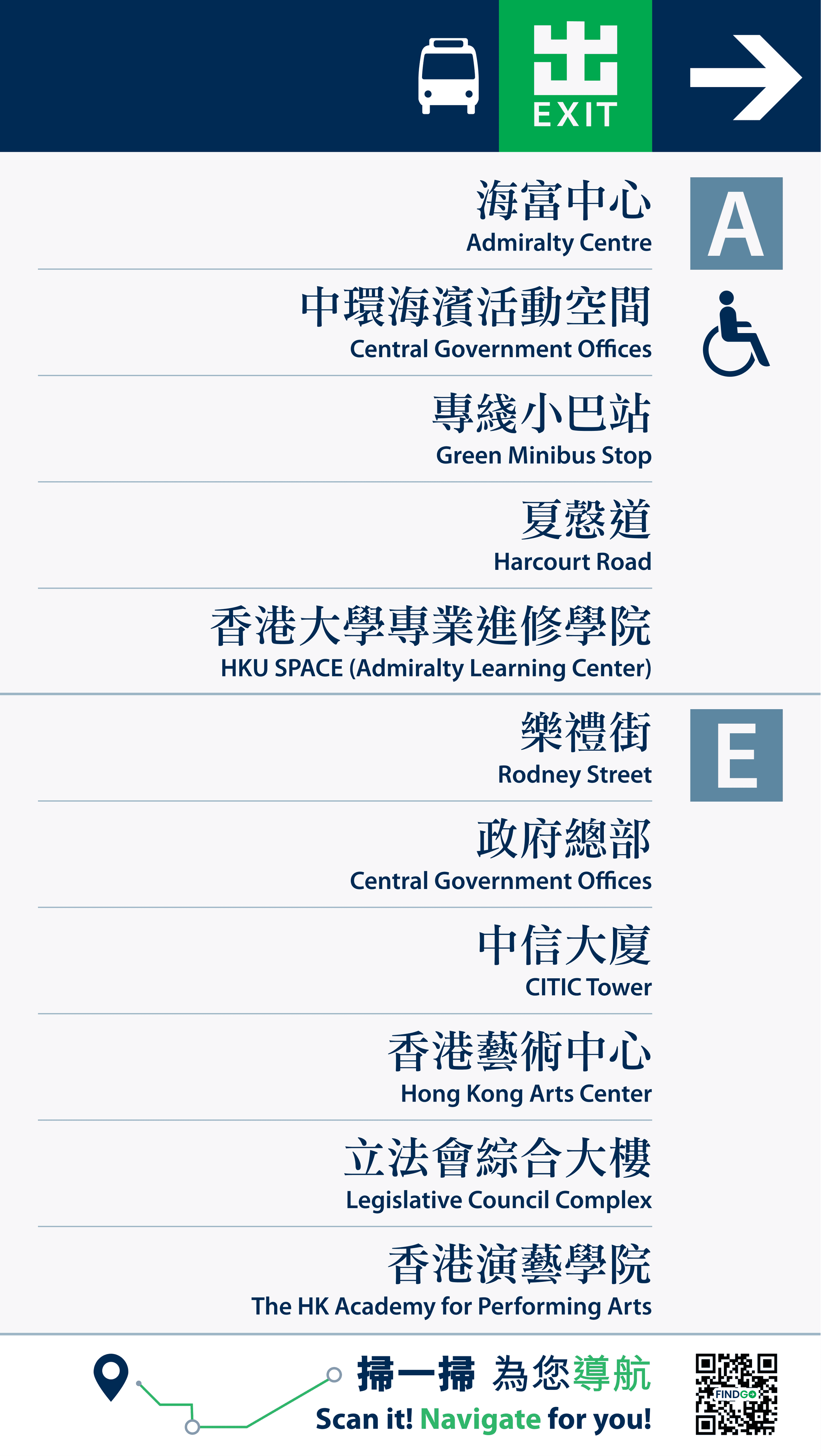
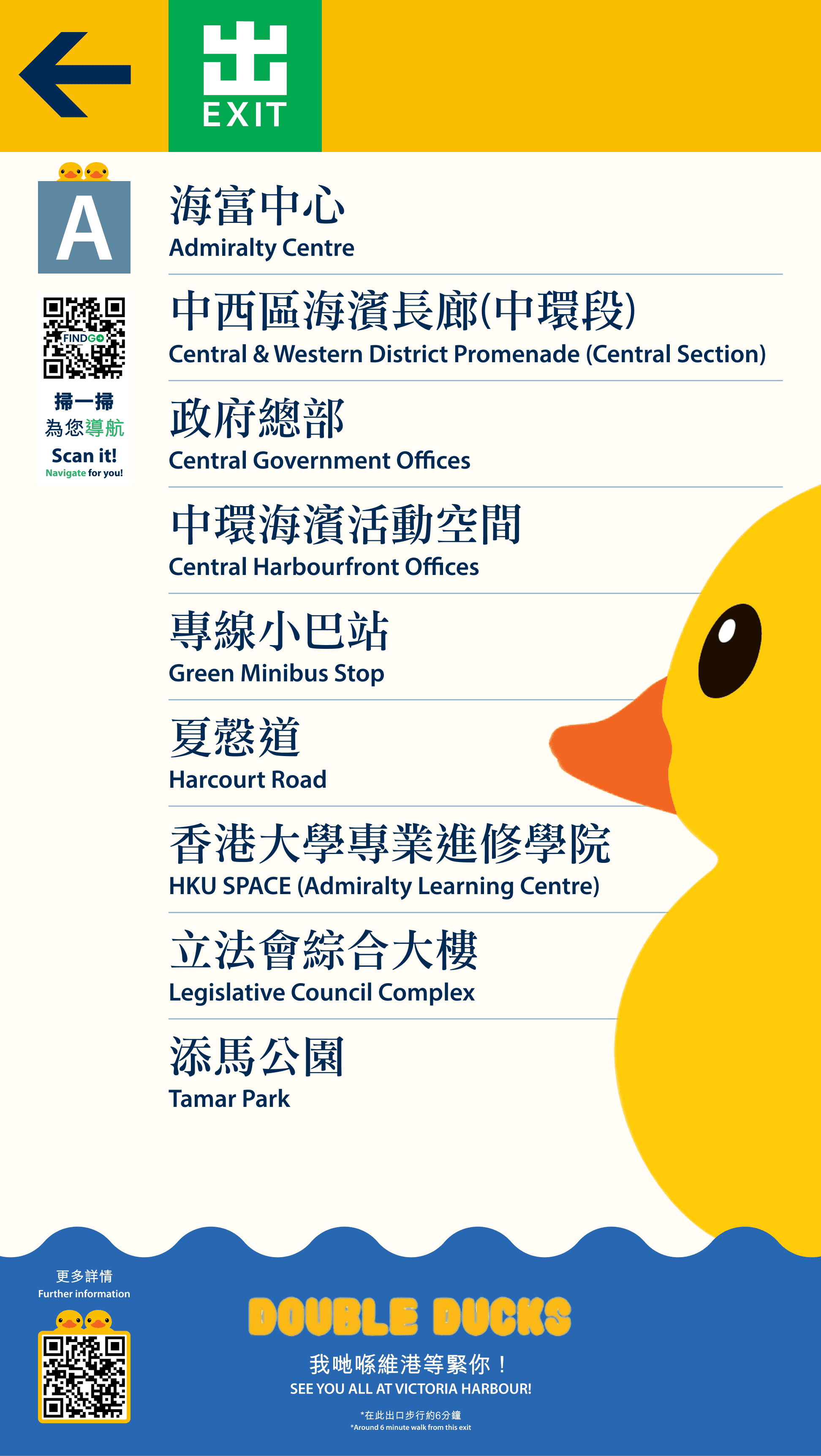
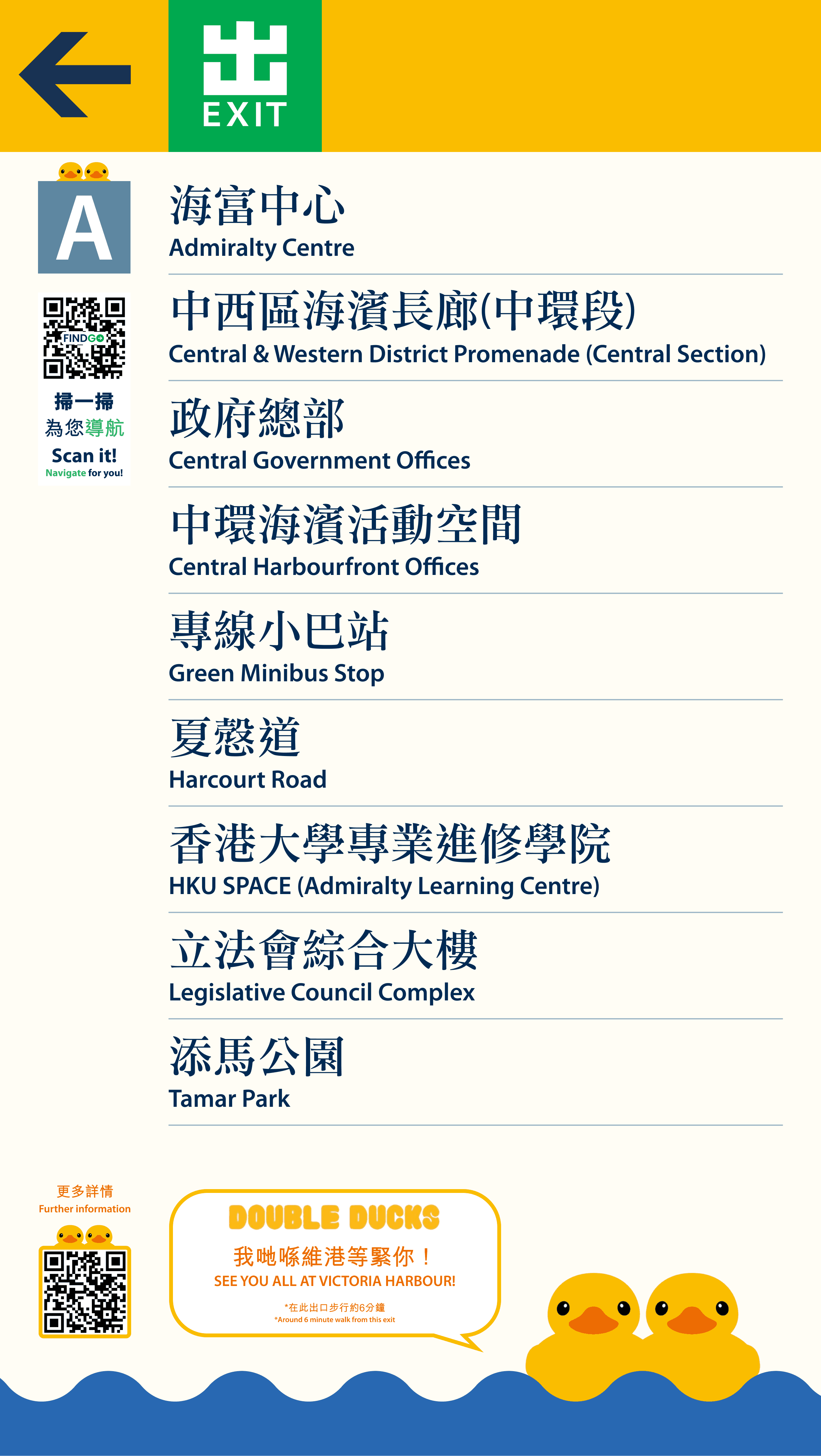
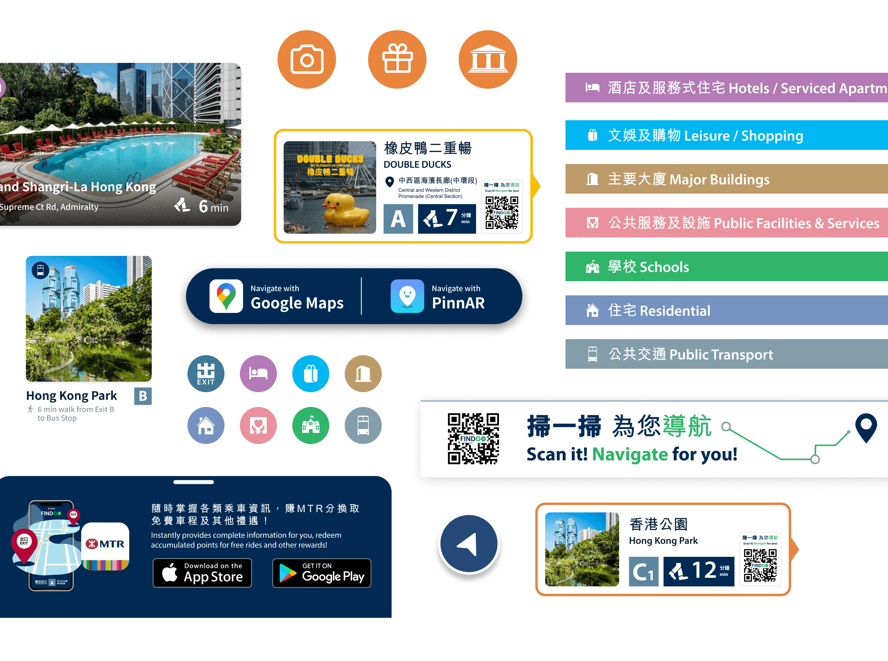
Exit Directory Display incorporates interactive and visually appealing designs that are specifically customised for seasonal events. This integration takes the user experience to the next level by adding more fun and excitement.
Final Product #3
We also includes a dedicated section for businesses to showcase their products, banners, and discounts. Users are encouraged to explore and engage with this section, creating a vibrant and interactive wayfinding experience.
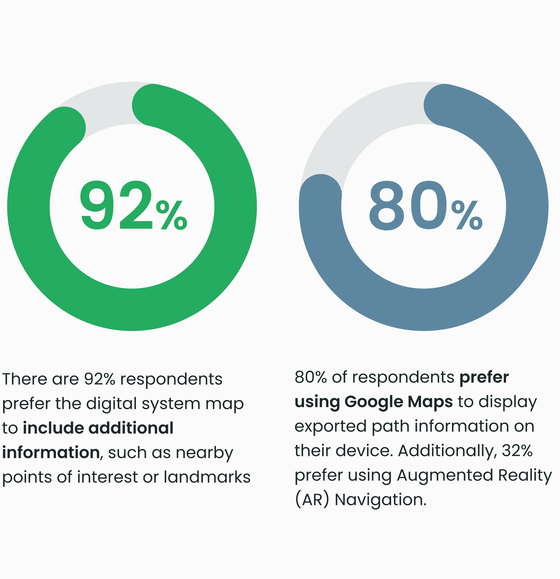
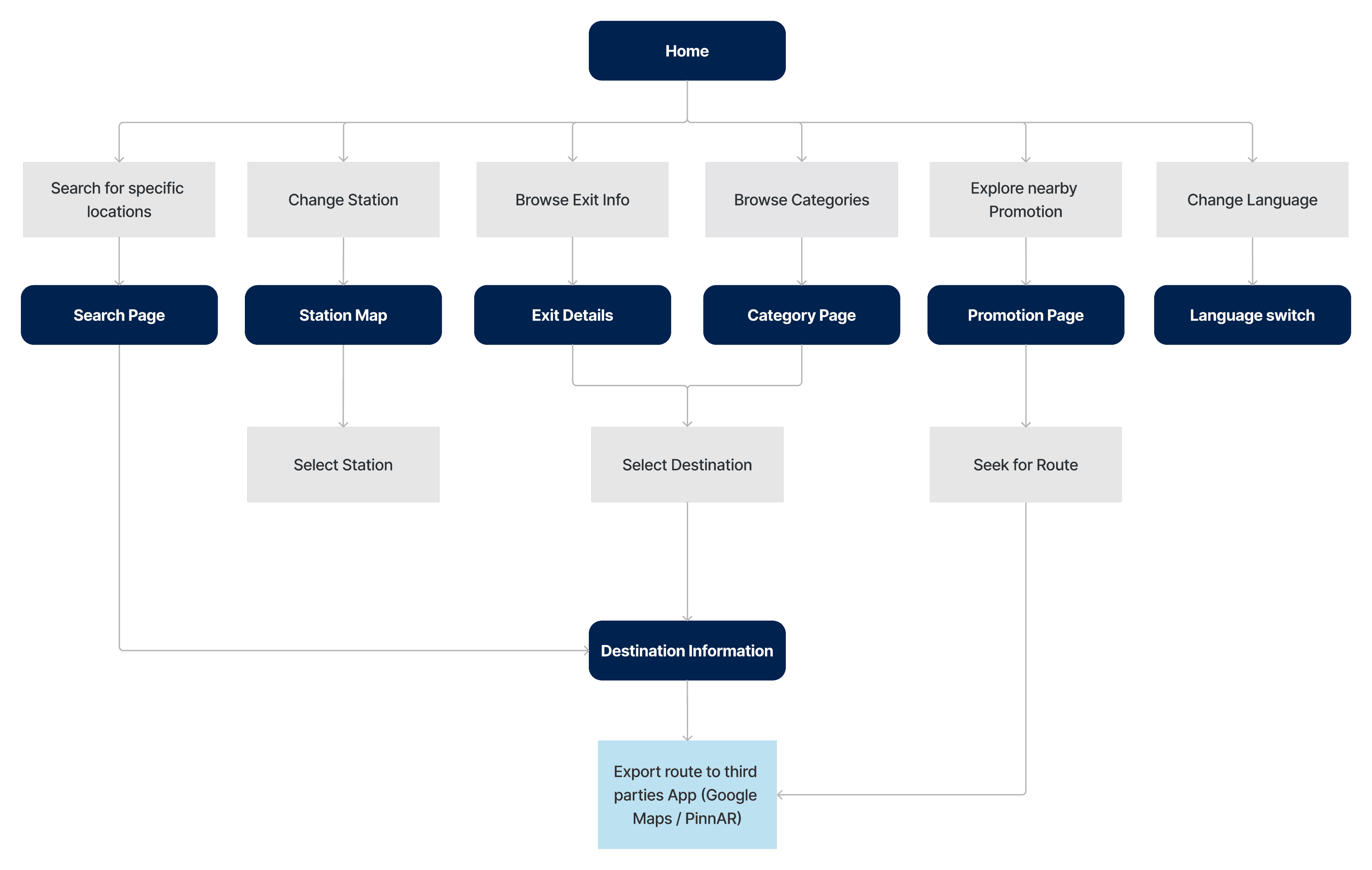
In order to improve user guidance and facilitate a seamless transition from the starting point to the destination, we integrate with well-known third-party navigation platforms such as Google Maps and PinnAR (AR navigation app).
If I had more time…
Final Thought
I have gained valuable insights and knowledge in wayfinding systems through this project. It has enhanced my skills in designing user-friendly digital systems for public spaces, particularly MTR stations. The field observations were instrumental in understanding user interactions and objectives. To achieve shared goals, it is crucial to strike a balance between user and company needs and expectations. This approach guarantees long-term success and satisfaction for everyone involved.
